Logo
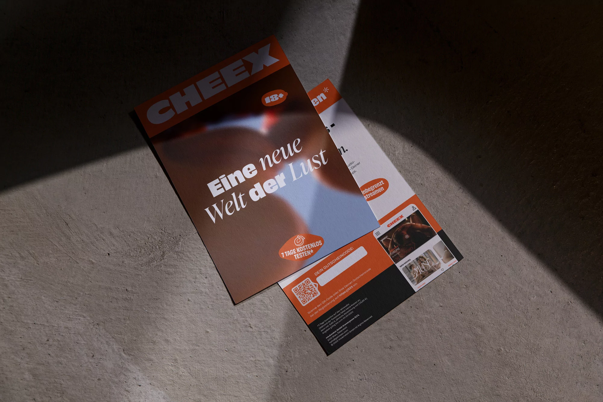
Two printed CHEEX brand promotional flyers resting on a textured concrete surface under dramatic diagonal light and shadow.
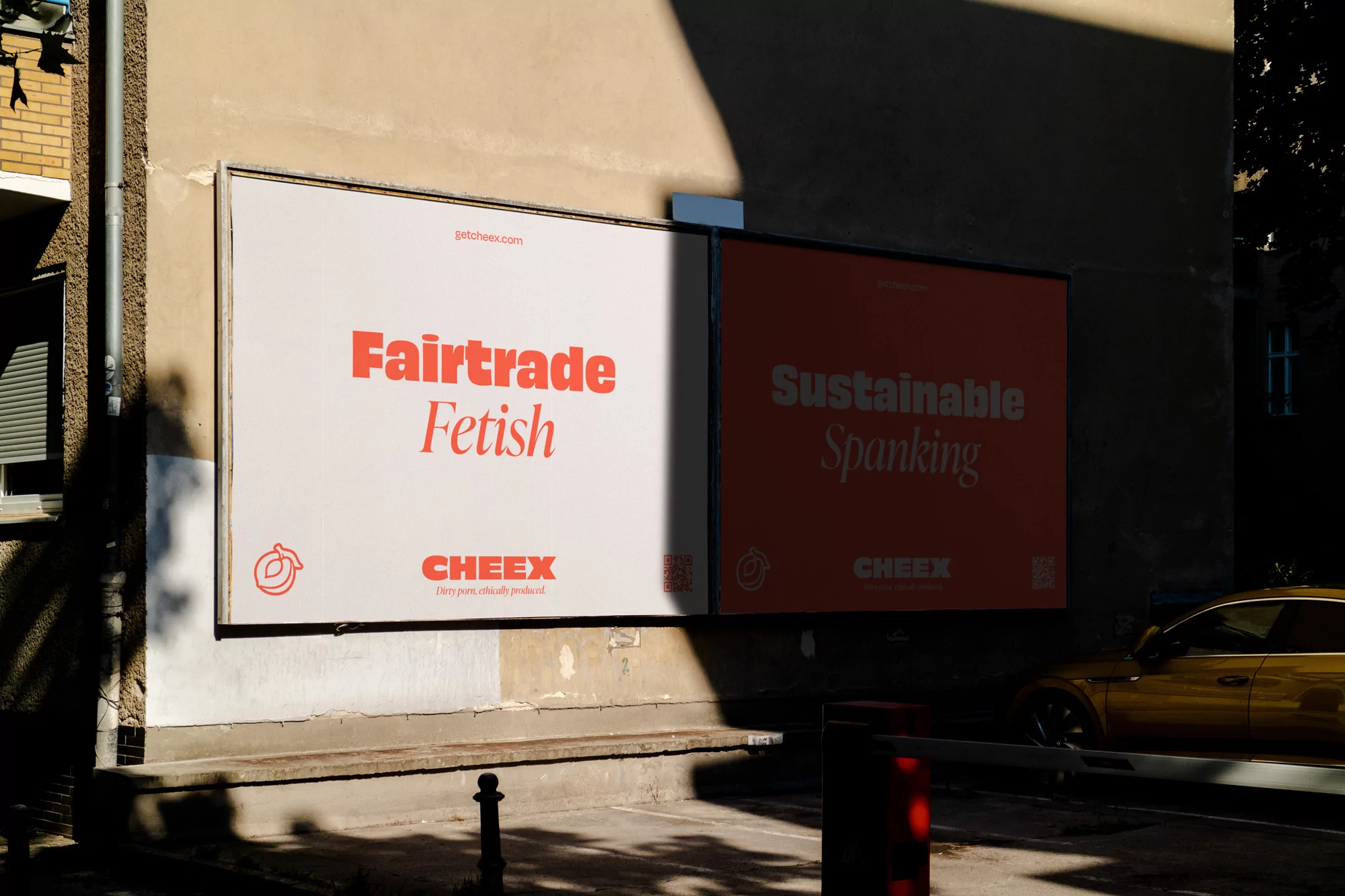
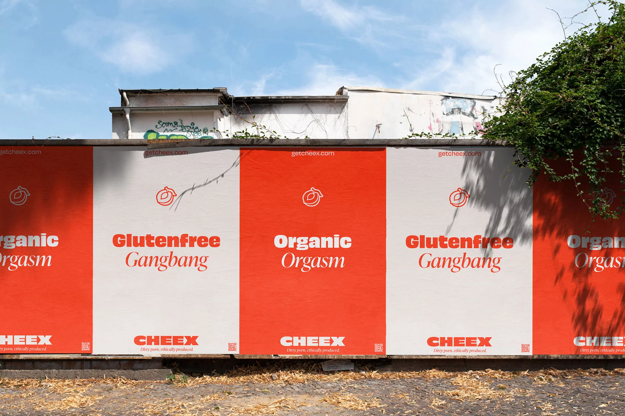
Outdoor billboard advertisement for CHEEX featuring bold red typography on cream and orange backgrounds mounted on an exterior wall.
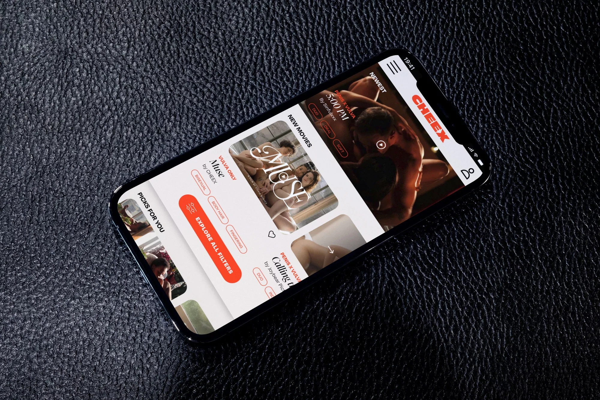
Smartphone displaying the CHEEX brand app interface resting on a dark textured leather surface
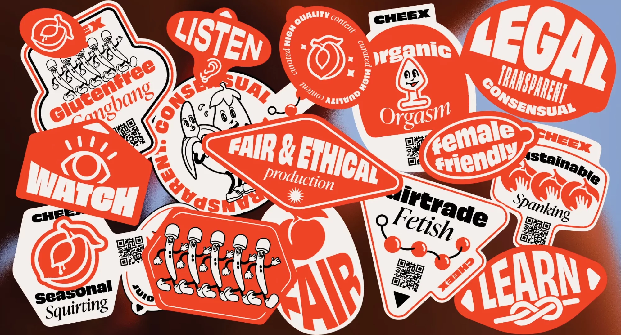
Collection of various red and white die-cut brand stickers with playful typography and illustrations on a dark surface.
Bright red shopping bag with white text resting on a modern black leather and chrome armchair in direct sunlight.
Red foil condom packet on a black background featuring white typographic brand identity design for CHEEX
CHEEX brand identity graphic featuring a white logo and text against a grainy, defocused intimate background.
A white business card with red branding resting on a textured rust-colored fabric surface
CHEEX outdoor brand identity posters with red and white panels displayed on a city wall under a clear sky.
Glass of water and red branded coasters with cartoon illustrations on a wooden table under natural light.
Two printed CHEEX brand promotional flyers resting on a textured concrete surface under dramatic diagonal light and shadow.
Outdoor billboard advertisement for CHEEX featuring bold red typography on cream and orange backgrounds mounted on an exterior wall.
Smartphone displaying the CHEEX brand app interface resting on a dark textured leather surface

CHEEX Brand Identity 2023

About

The brand identity for CHEEX, developed by designers PLUSMINUS and Jasmin Scharrer, establishes a bold visual language across both physical and digital touchpoints. The project employs a high-contrast palette of vibrant red, white, and burnt orange, anchored by confident, clean typography that carries the brand’s messaging across varied mediums. Execution ranges from extensive out-of-home advertising, including urban billboard installations and wheat-paste posters, to tangible brand assets like die-cut stickers, foil packaging, and minimalist print collateral. The design leans into a tactile aesthetic, often placing graphic elements against textured surfaces like rust-colored fabrics and concrete to emphasize the physical presence of the brand. Digital components are integrated through a mobile app interface that maintains the brand’s typographic hierarchy. By pairing playful, illustrative elements with a structured, minimalist layout, the identity maintains consistency across packaging, stationery, and environmental displays.

Brand

Credits

Styles

Techniques

5000+ profiles to discover

Sign up to gain access to the entire directory. It’s free.

Visie is a curated library of creative professionals.
Trusted by