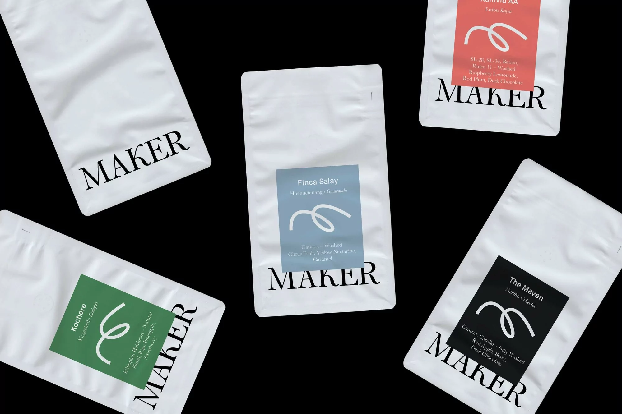
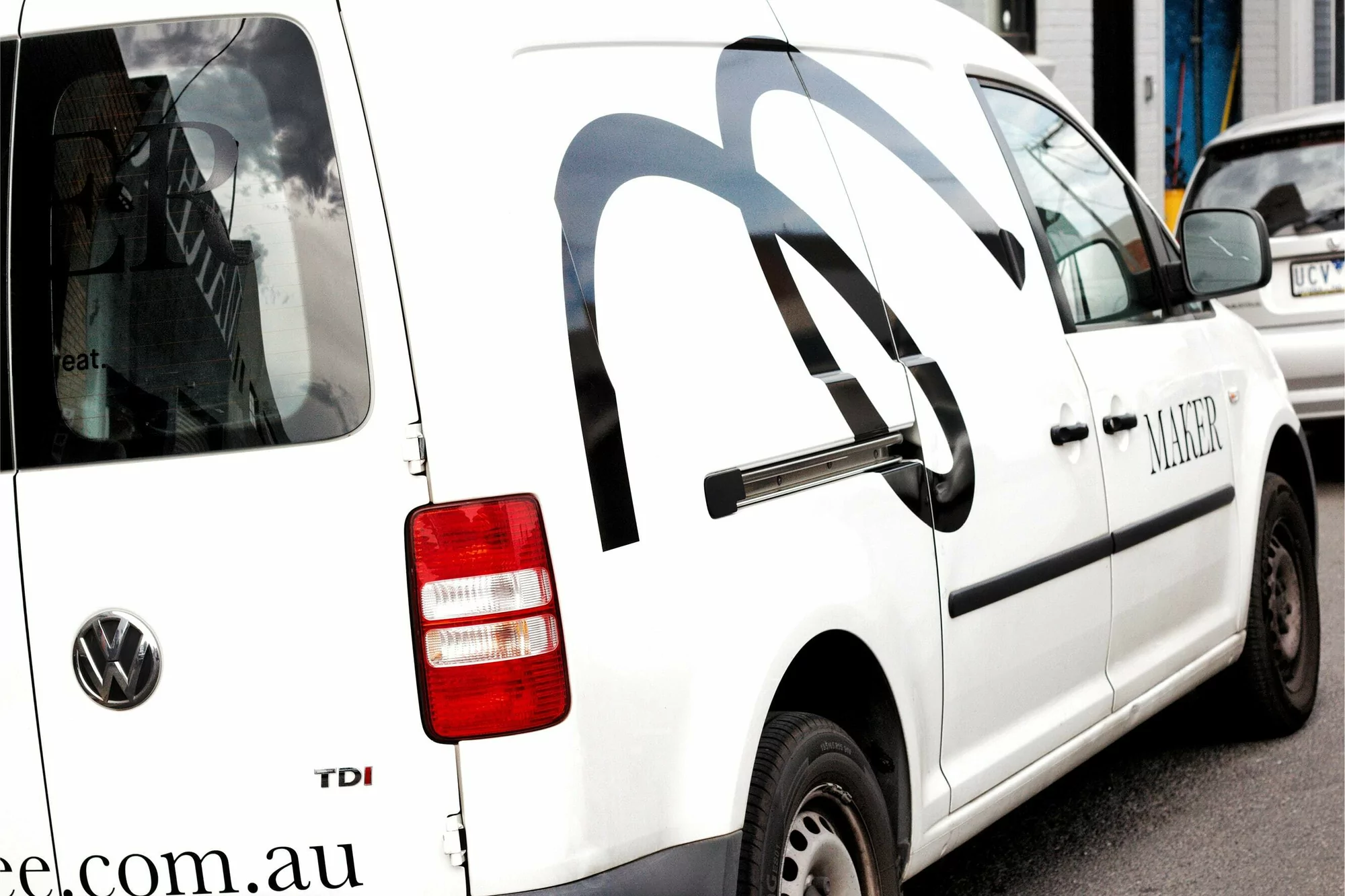
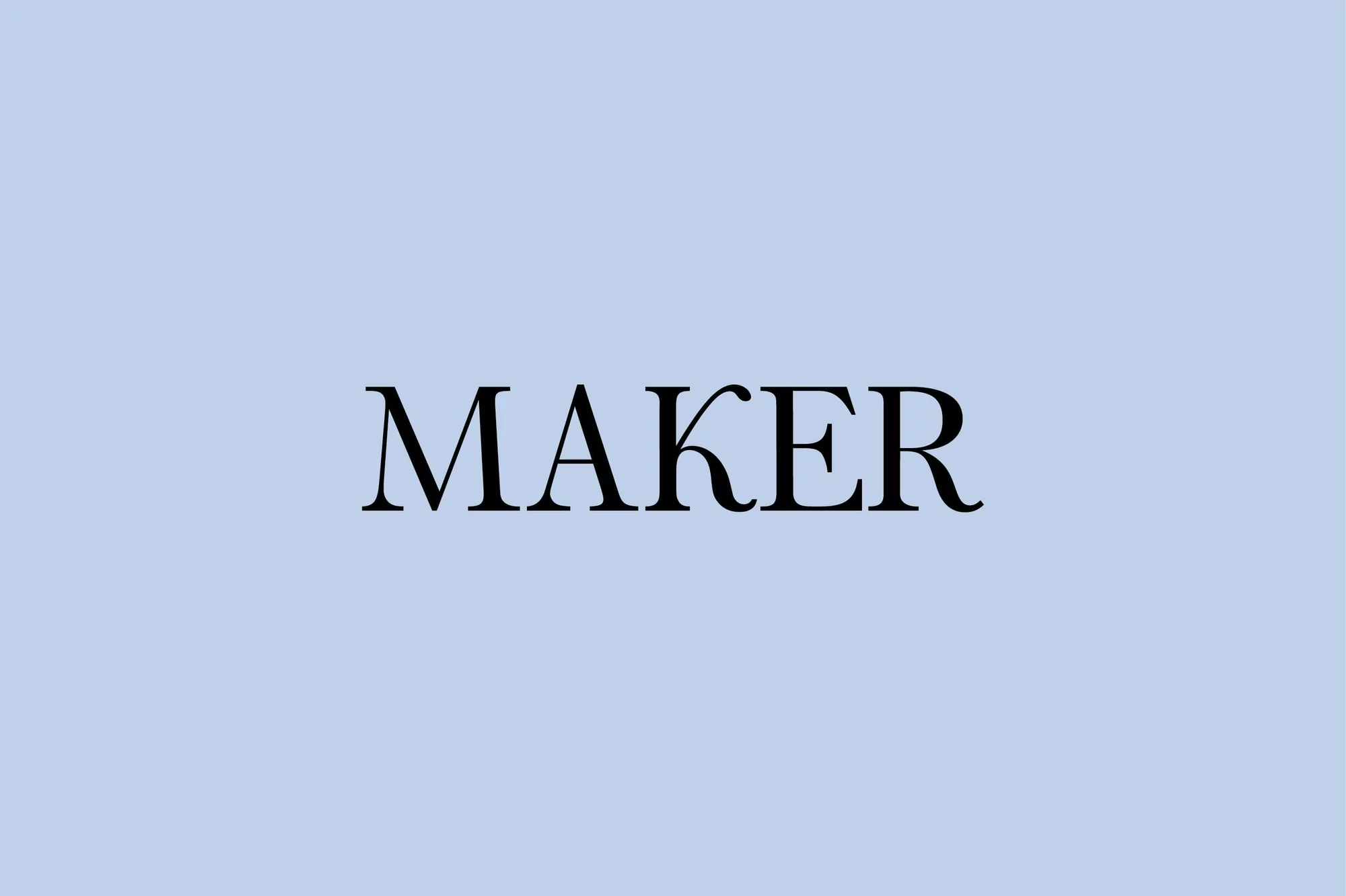
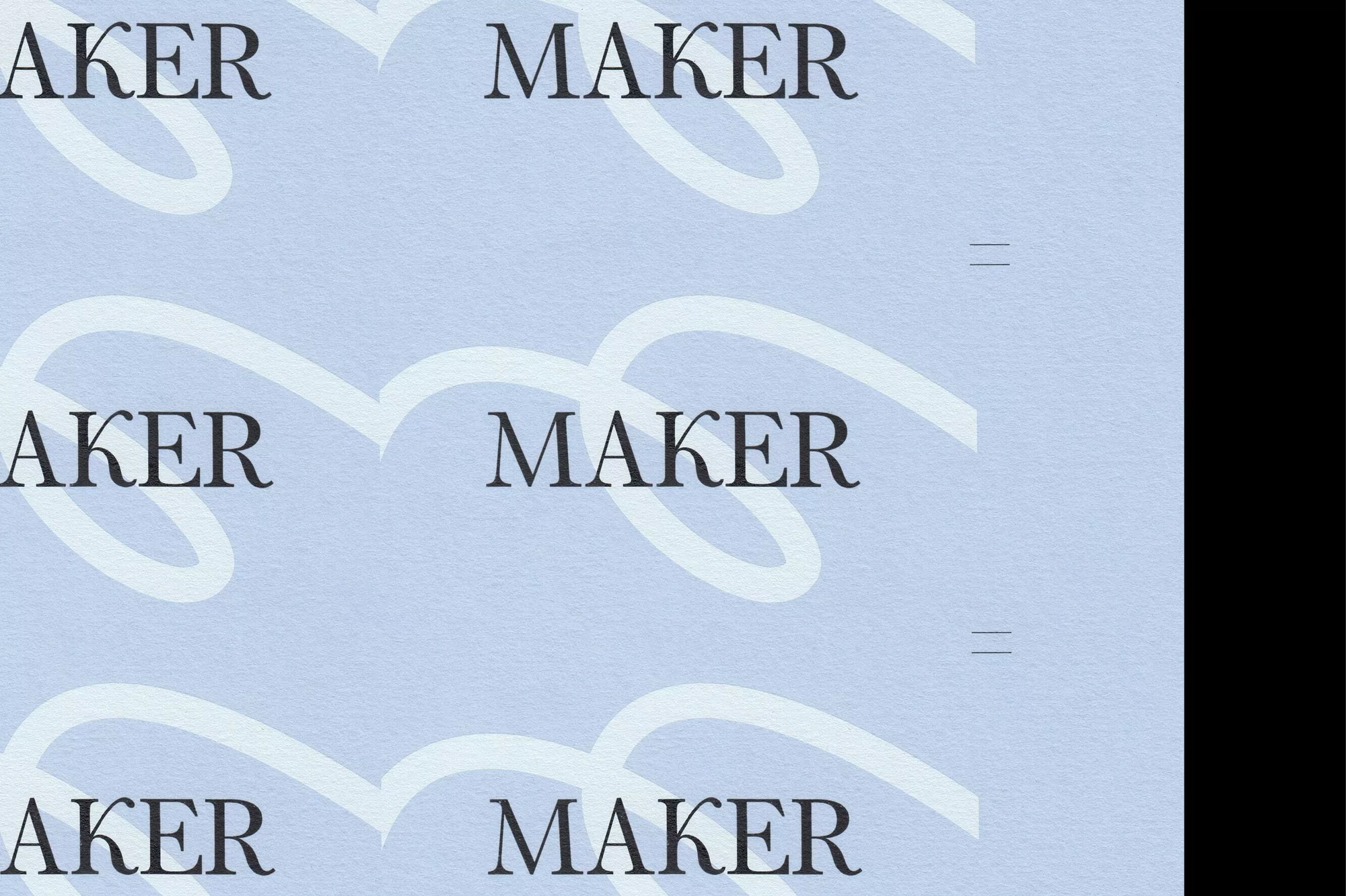
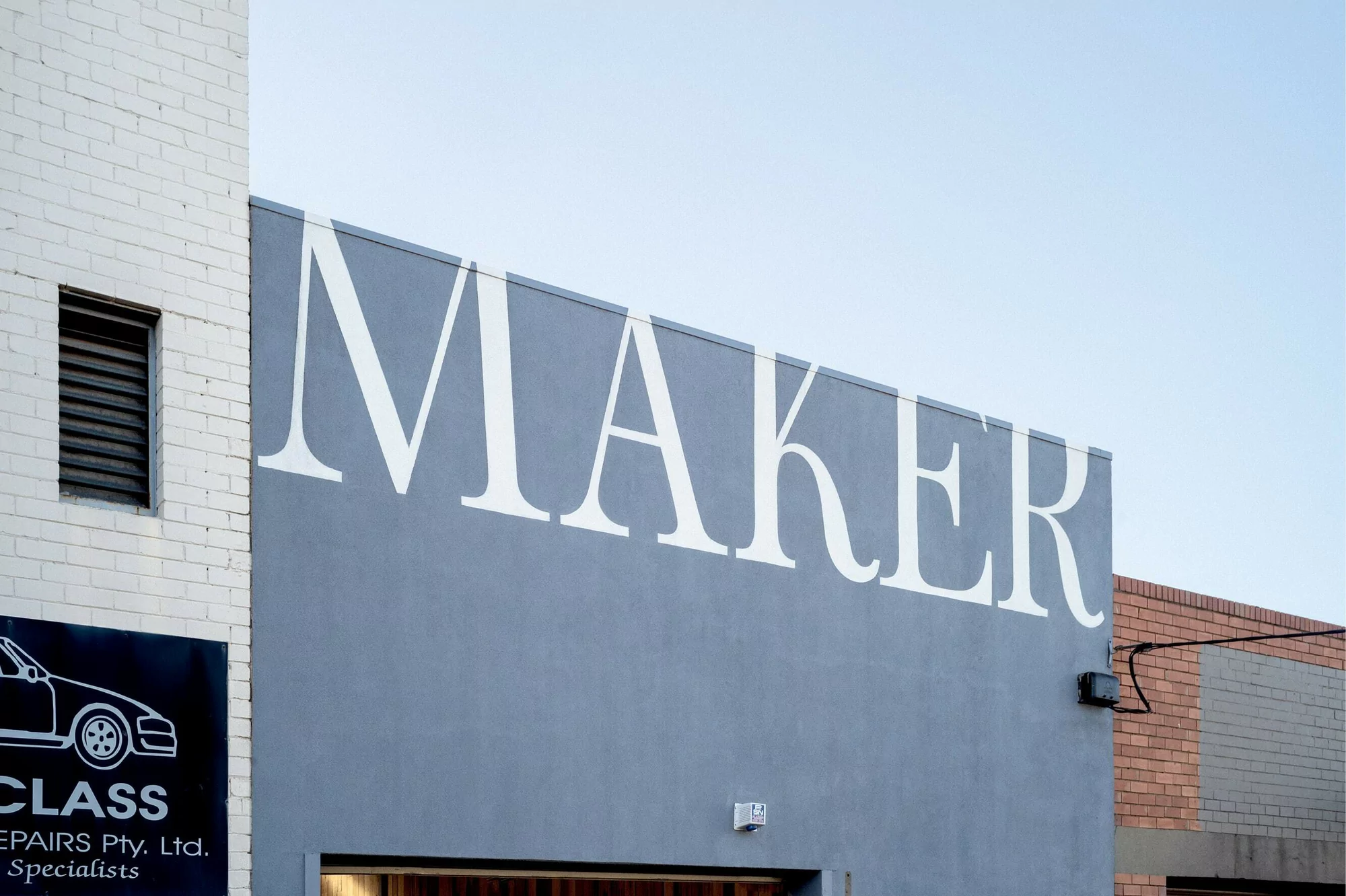
In a crowded marketplace where tech-forward branding often leans into cold abstractions, the new visual identity for Maker offers a refreshing masterclass in restrained, sophisticated communication. Orchestrated by the creative team at Never Now, the project transforms Enterprise and B2B Software into a tactile experience that feels as much like a premium lifestyle brand as it does a corporate entity. This brand identity project relies on the elegant tension between a bold black serif typeface and a curated, desaturated color palette, grounding high-end technology in human-scale aesthetics. Through a series of commercial applications—ranging from minimalist product packaging to the bold, environmental graphics applied to architectural facades and service vehicles—the work maintains an unwavering sense of consistency. Josh Robenstone provides the photography, utilizing natural light and high-contrast compositions to emphasize the structural clarity of the design. The usage of typographic elements across digital UI illustrations and physical touchpoints demonstrates a deep understanding of visual systems, while the inclusion of subtle, paper-like textures provides an organic quality that grounds the digital-first nature of the business. By stripping away visual noise, Never Now has successfully built a versatile, cohesive identity that reads as both authoritative and approachable, effectively bridging the gap between complex software utility and modern graphic design excellence.