
Caracol: Brand Identity

Aug 2019
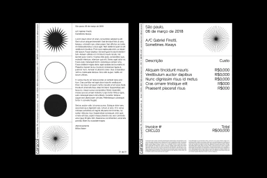
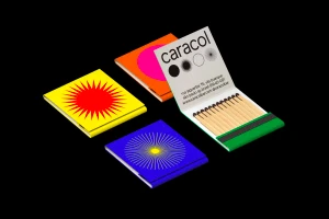
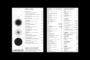
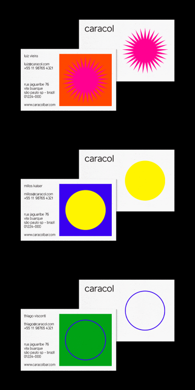
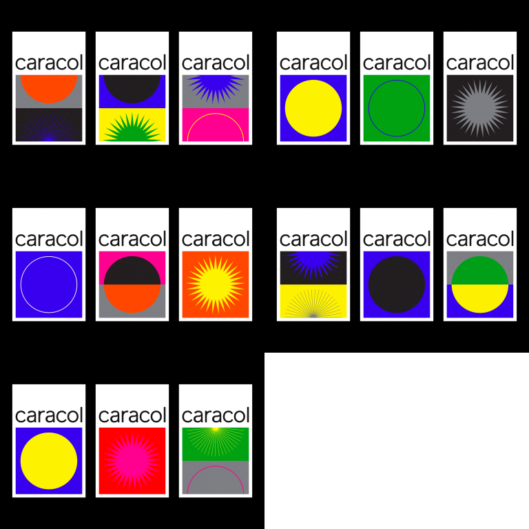
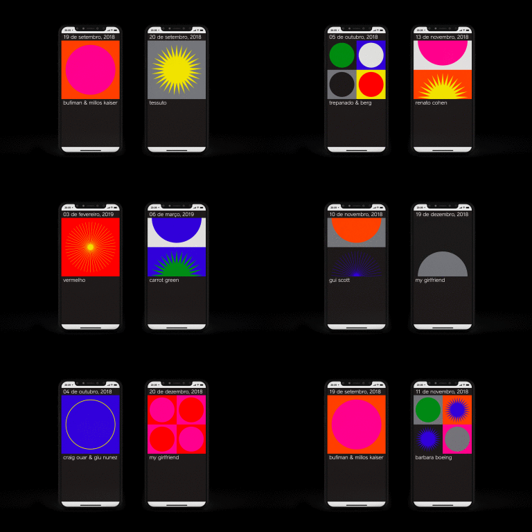
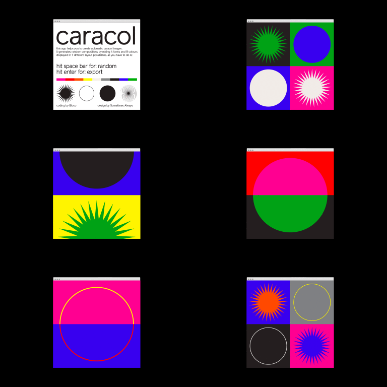
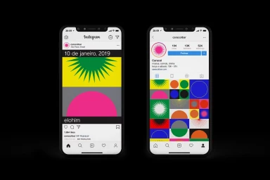
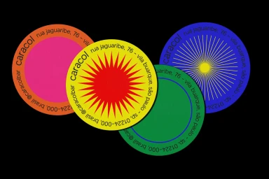
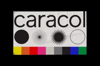
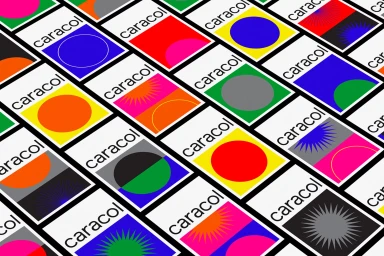
The brand identity for Caracol, developed by the design studio Sometimes Always, functions as a masterclass in modular, high-contrast visual communication. By blending Swiss-inspired minimalism with a vibrant, saturated color palette, the studio creates a cohesive system that feels both functional and kinetic. The project leans into a rigorous geometric language, where stylized sunbursts, circular motifs, and clean sans-serif typography serve as the primary pillars of the brand. This structured approach is applied with surgical precision across a diverse range of touchpoints, from tactile printed materials like matchbooks and business cards to complex digital interfaces, including software UI and dynamic social media grids. The use of vector-based illustrations allows the brand to maintain its integrity whether rendered in stark black and white or explosive, high-energy neon hues. The system prioritizes white space and logical hierarchy, ensuring that even complex informational documents like restaurant menus and invoice templates remain legible and visually arresting. Ultimately, the work succeeds by balancing professional, corporate-level organization with an artistic, experimental edge, resulting in a playful yet authoritative visual identity. This project showcases the power of systematic design, where flat geometric motifs and thoughtful typography work in concert to build a memorable, multi-platform brand presence that feels consistently modern, intentional, and bold.
Horizontal, Commercial, Clean, Graphic
Typography
Advertising Campaign
