
Miilkiina: Brand Identity
Sep 2020
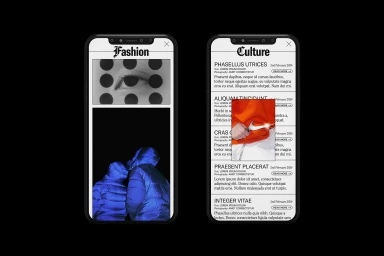
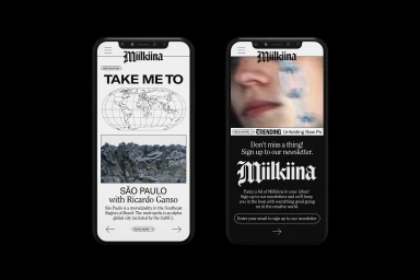
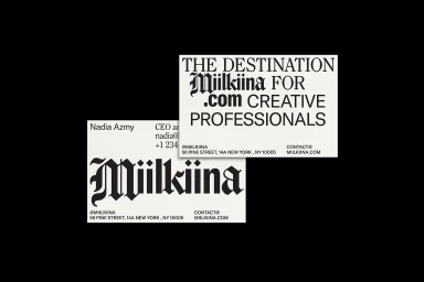
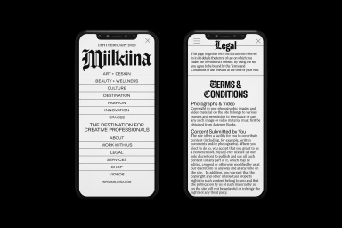
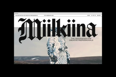
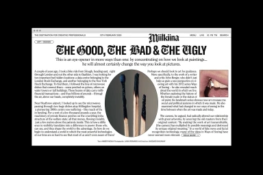
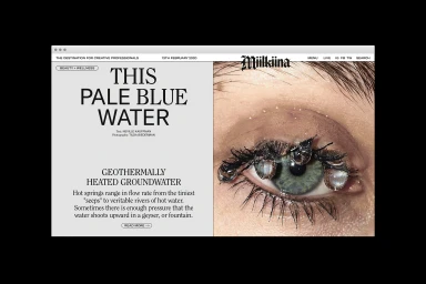
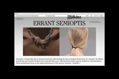
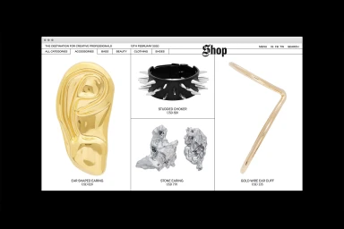
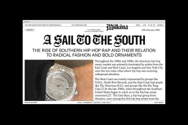
The Miilkiina brand identity project serves as a masterclass in modern editorial design, transcending the boundaries between a high-end digital publication and a sophisticated e-commerce platform. Under the meticulous graphic design stewardship of Sometimes Always, the identity leans heavily into a stark, monochromatic color palette that commands attention through its minimalist discipline. The system utilizes a bold fusion of gothic-style typography and clean sans-serif layouts, establishing a visual hierarchy that feels both academic and inherently contemporary. Across the interface, the design strategy incorporates UI illustration techniques that treat digital screen space as a classic broadsheet canvas, prioritizing legibility and negative space to allow the photography—ranging from high-fashion macro shots to abstract jewelry detailing—to stand as the primary narrative device. By blending the structured rigors of corporate branding with the textural depth of editorial storytelling, the project achieves a seamless environmental juxtaposition where sharp, high-contrast imagery meets soft, nuanced layouts. The resulting aesthetic is one of elevated, cinematic precision that captures the essence of a modern creative destination. Through the careful balance of ornate letterforms and rigid grid structures, Miilkiina successfully positions itself as a premium space for culture and fashion, offering a refined, highly curated experience that resonates with a sophisticated global audience interested in the intersection of innovation, design, and style.
Horizontal, Commercial, Minimalist, Clean
Typography, UI illustration
Website / Web
