
Callen-Lorde
Brand Identity
Jan 2018
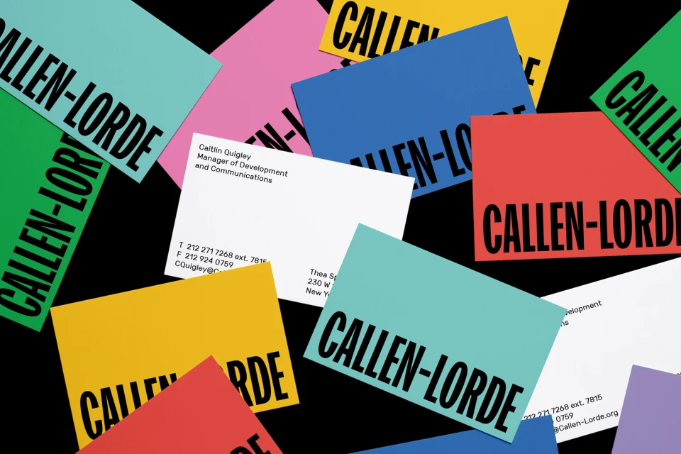
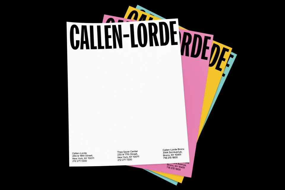
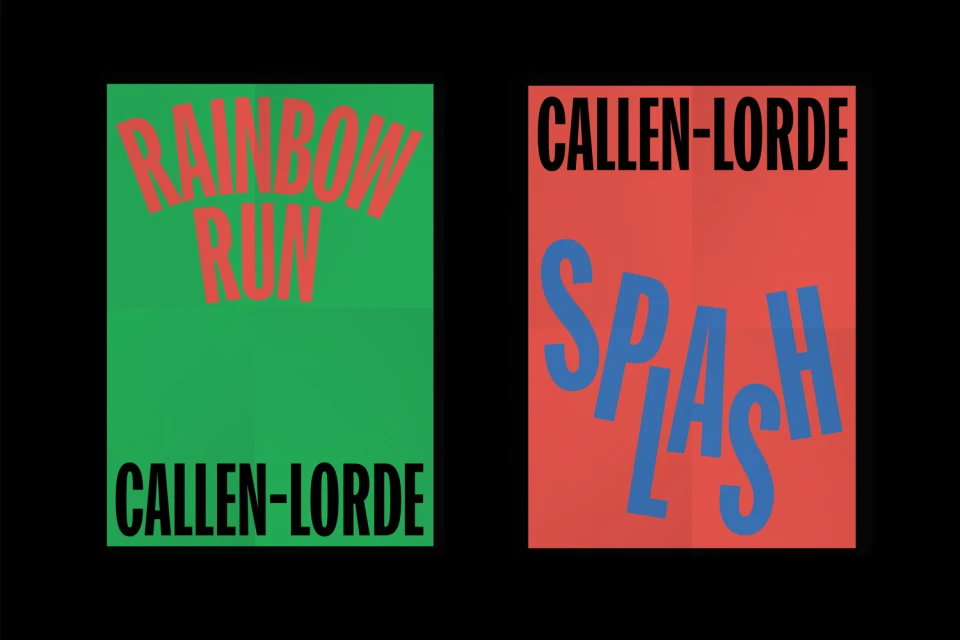
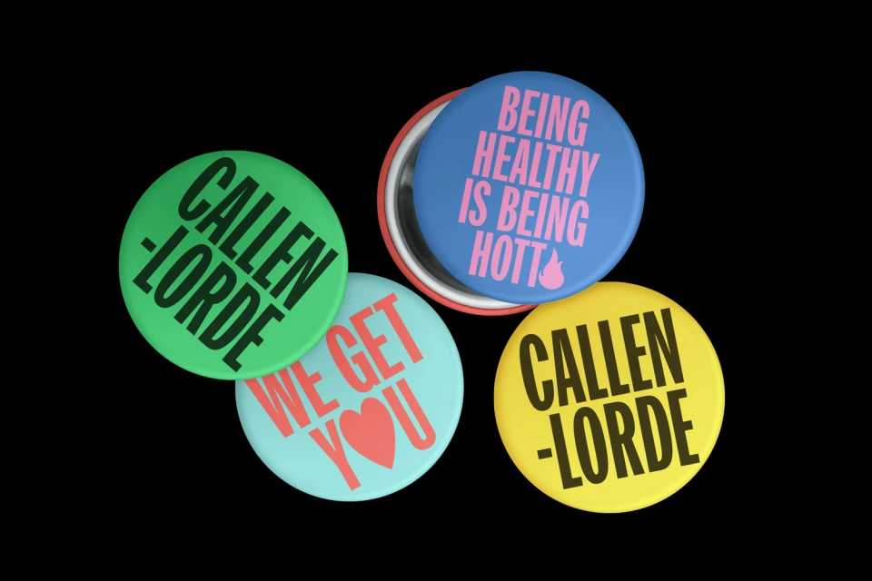
In the fast-paced realm of public awareness and non-profit communications, establishing a visual language that is both accessible and punchy is a significant challenge. For the Callen-Lorde brand identity project, Mother Design has executed a masterclass in modular graphic design, stripping away the unnecessary to let bold utility speak for itself. The visual system hinges on an uncompromising use of high-contrast color blocking, utilizing a vibrant, saturated palette of red, yellow, green, and blue to anchor every touchpoint. By applying this identity across a diverse range of assets—from stationery and business cards to event collateral like the Rainbow Run posters—the design team has created a cohesive, highly structured aesthetic that feels both urgent and welcoming. The reliance on clean, bold sans-serif typography ensures that essential organizational messaging remains legible and commanding, even when applied to tactile surfaces like circular pin-back buttons or folded paper prints. The decision to capture these elements against a stark black background serves to heighten the visual impact, emphasizing the clean lines and technical precision of the layout. With studio strobe lighting utilized to sharpen the edges of these physical assets, the project manages to translate a standard identity suite into a dynamic, commercial display that effectively elevates the organization's public presence through simple, effective, and infinitely scalable design principles.
Commercial, Clean
Typography
Advertising Campaign
