
AIGA
Brand Identity
Mar 2017
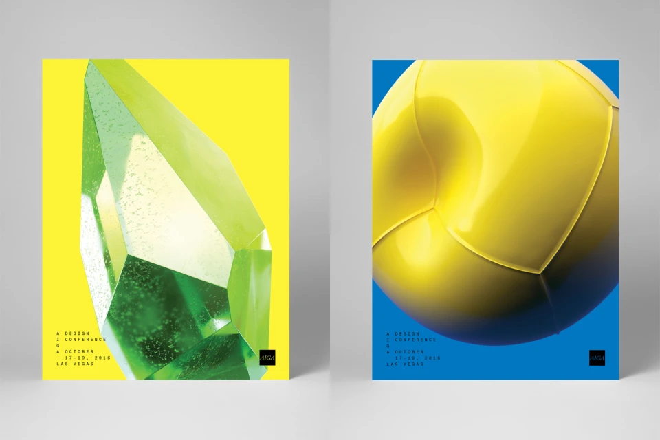
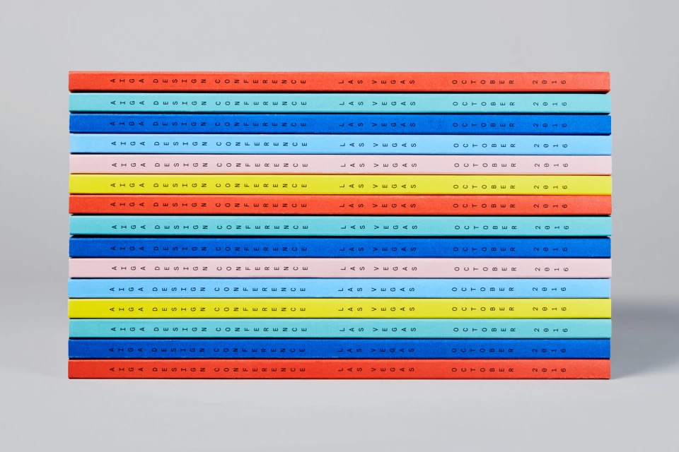
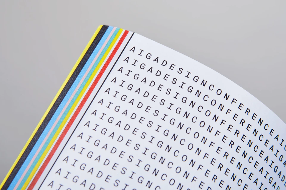
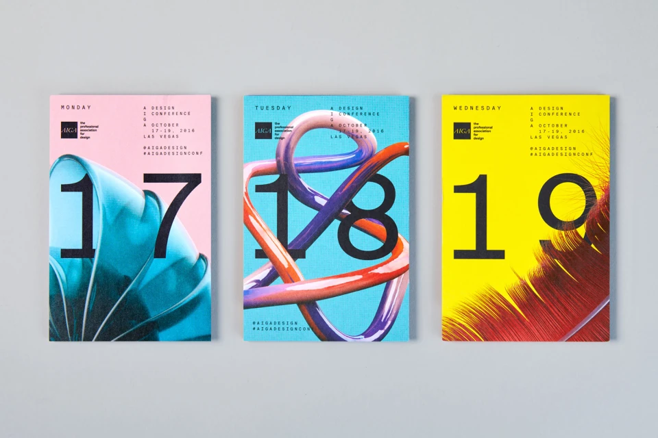
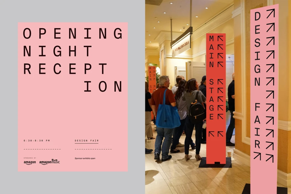
For the AIGA Design Conference, the brand identity system developed by Mother Design serves as a masterclass in modular communication and structured visual storytelling. The project leans into a rigorous application of typography, utilizing a clean, sans-serif aesthetic that anchors the disparate promotional elements across a diverse media landscape. By juxtaposing bold color blocking with nuanced 3D render and CGI techniques, the identity creates a dynamic tension that feels both high-end and accessible. The execution flows seamlessly from high-impact promotional posters featuring abstract forms and geometric crystals to the granular, repetitive precision of printed booklets and event programs. This commercial approach is further solidified by the thoughtful application of studio strobe lighting, which emphasizes the crisp production quality and tactile paper textures inherent in the printed collateral. The identity system shines brightest in its environmental application, where the brand transitions from the printed page to the physical space of the convention center. Through the strategic use of vertical signposts and color-coded pathways, the design team effectively guides attendees while maintaining visual consistency. This project masterfully synthesizes abstract artistry with functional corporate design, proving that a disciplined, minimalist layout can achieve a significant, memorable presence within the competitive realm of media and entertainment branding while ensuring every touchpoint feels unmistakably unified.
Horizontal, Commercial, Clean, Minimalist, Graphic
Typography
Digital Media & Publishers
Advertising Campaign
