
unknown: Brand Identity

Jan 2020
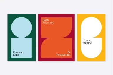
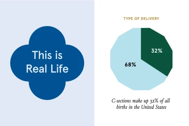
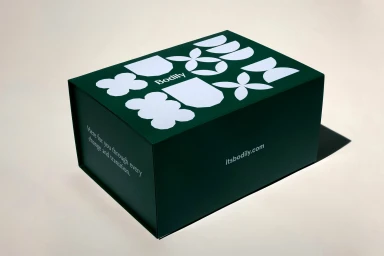
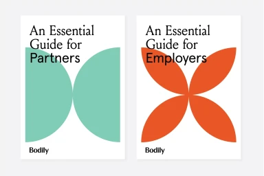
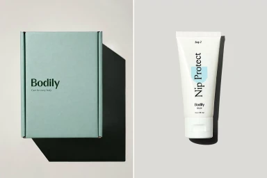
The brand identity for Bodily represents a masterclass in modern, minimalist design, transcending the typical aesthetic of the healthcare industry. Developed by the team at Mother Design, the visual system leans into a sophisticated marriage of functional clarity and artistic playfulness. The identity utilizes a robust toolkit of geometric shapes, high-contrast color blocking, and a carefully curated serif and sans-serif typography pairing to communicate complex topics with empathy and intelligence. Across the various brand touchpoints—from structured product packaging in soft, muted palettes to editorial book covers and informative infographics—the design remains consistently intentional. The execution relies heavily on the clean application of vector assets and intentional negative space, which keeps the brand feeling both approachable and authoritative. By balancing soft light studio photography with sharp, rhythmic UI illustrations, the identity feels human rather than purely clinical. Whether displayed on a matte forest green storage box or within a data-driven visualization, the brand mark and its associated icons act as a cohesive thread. This project serves as a prime example of how commercial graphic design can elevate essential services by transforming raw information into a structured, visual language that resonates deeply with the consumer, ensuring that every element of the brand feels deliberate, professional, and entirely cohesive.
Horizontal, Commercial, Clean, Minimalist
