
Angle Developments
Brand Identity
May 2017
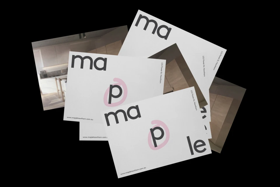
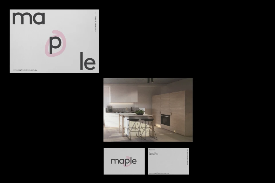
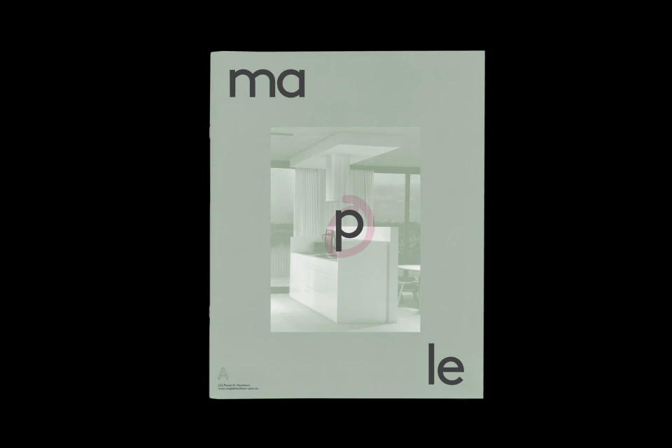
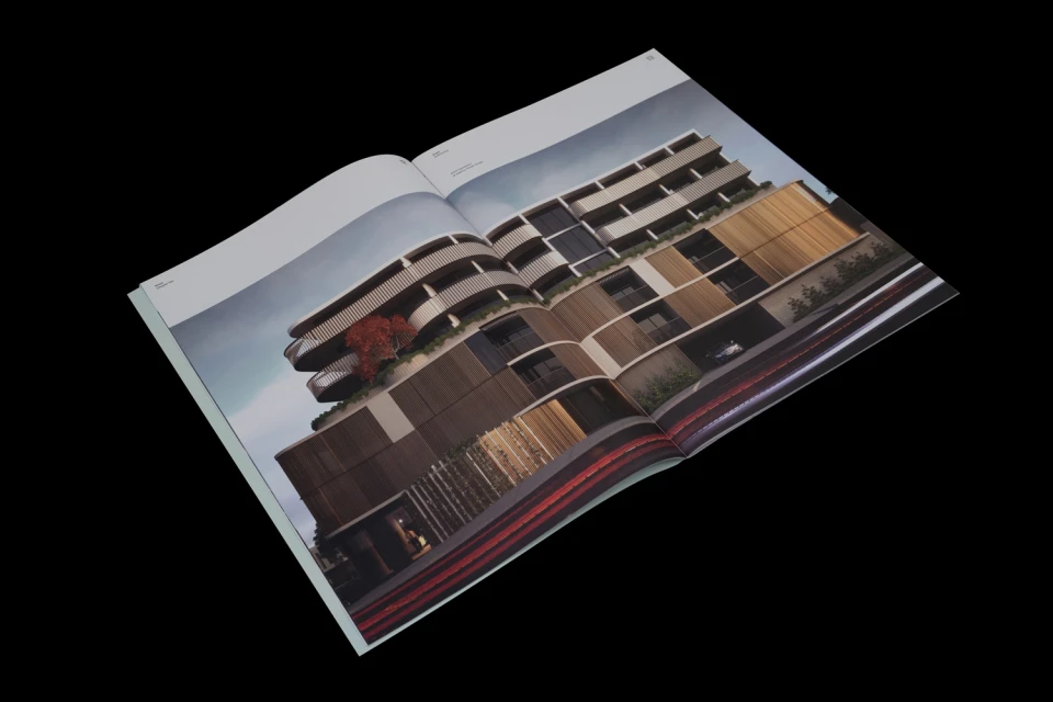
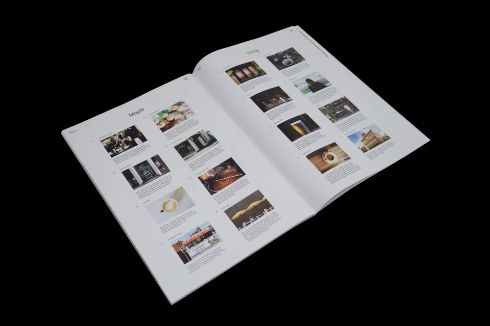
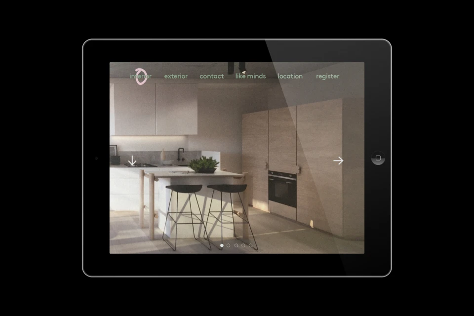
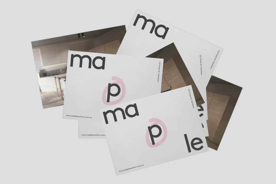
Angle Developments presents a sophisticated brand identity for its Maple Hawthorn real estate project, expertly crafted by the team at SPGD. This comprehensive visual system leans into a high-end, minimalist aesthetic, successfully bridging the gap between corporate professional standards and contemporary residential lifestyle appeal. At the heart of the identity is a deliberate focus on typography, utilizing clean, dark sans-serif letterforms that ground the brand in modern reliability. A recurring gestural motif—a soft, hand-drawn pink circle accentuating the letter p within the logotype—provides a subtle, humanizing counterpoint to the stark, architectural precision of the overall presentation. The design execution leverages a versatile palette of muted sage, white, and charcoal, creating a cohesive visual language that flows seamlessly across diverse touchpoints, including printed collateral, editorial-style brochures, and digital interfaces. The work integrates high-quality 3D render/CGI imagery of interiors, where light wood cabinetry and minimalist fixtures communicate a clear sense of space and quality. By utilizing a structured grid layout for marketing materials, SPGD captures an editorial sensibility that elevates the development beyond traditional property advertising. This project demonstrates an elevated approach to the real estate industry, where the careful synthesis of graphic design and architectural visualization creates a premium, cohesive brand narrative that feels both aspirational and deeply rooted in contemporary living.
Horizontal, Commercial, Clean, Minimalist
Typography
Real Estate Platforms
