
Angle Developments Brand Identity 2017
About
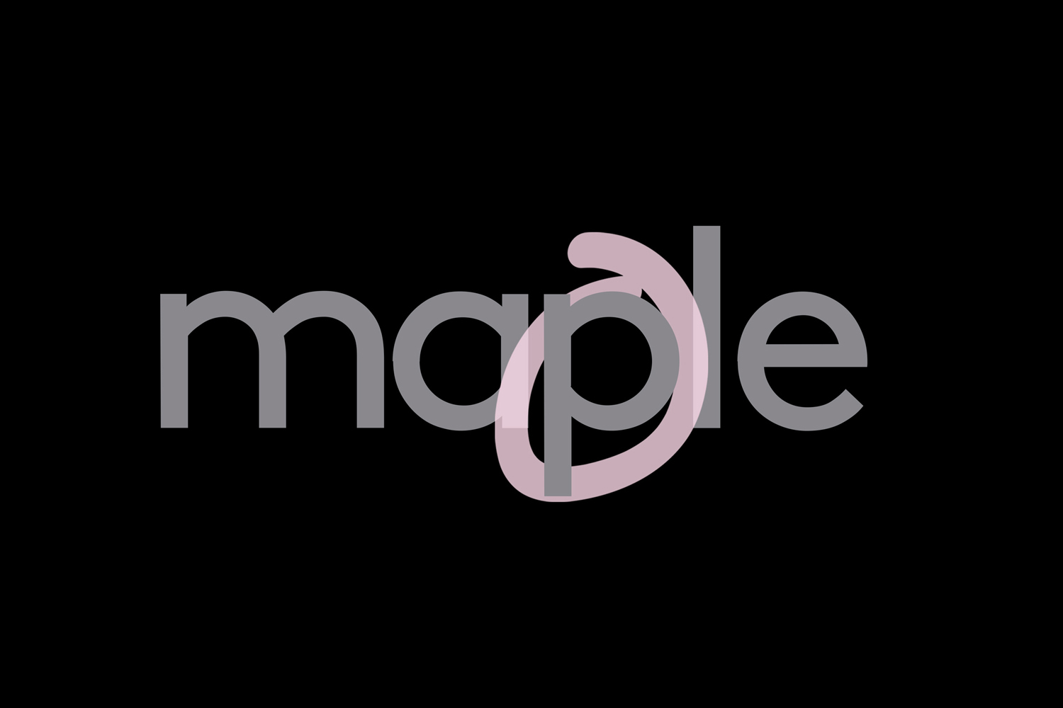
This graphic design piece presents a minimalist brand identity for Angle Developments, created by SPGD under the project titled Brand Identity. The composition features the word maple rendered in clean grey lowercase typography against a solid black background. A distinctive soft pink loop encircles and intertwines with the letter p, adding a subtle touch of contrast and modern branding character. The overall layout is clean, balanced, and executed with precise vector lines, creating a striking typographic focal point.
Brand
Project
Keywords
Credits
Styles
Techniques
Background
Black Seamless
Context
Website / Web