
Andrew Burns Architecture
Brand Identity
Mar 2018
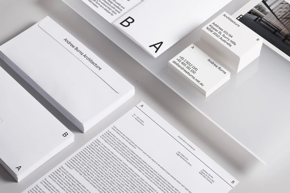
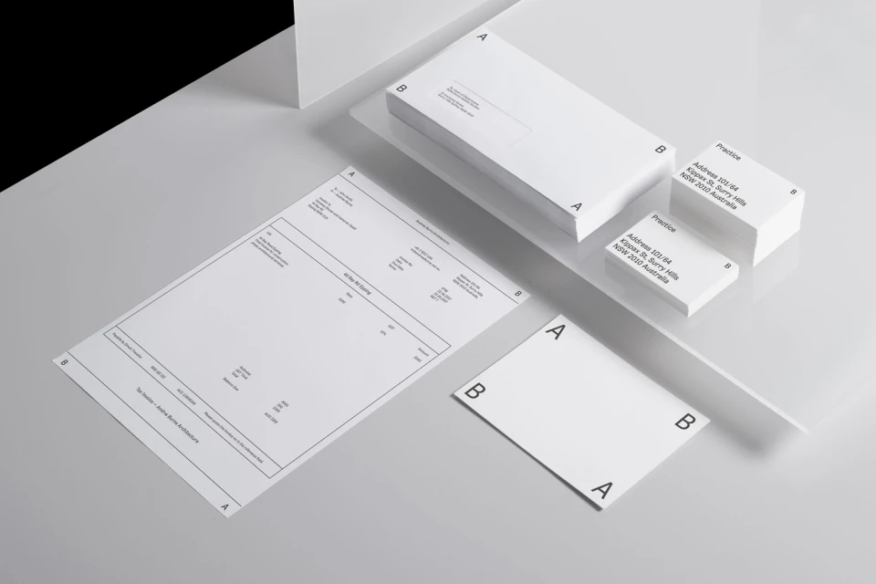
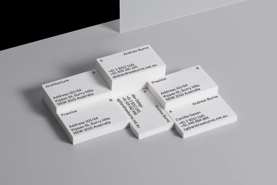
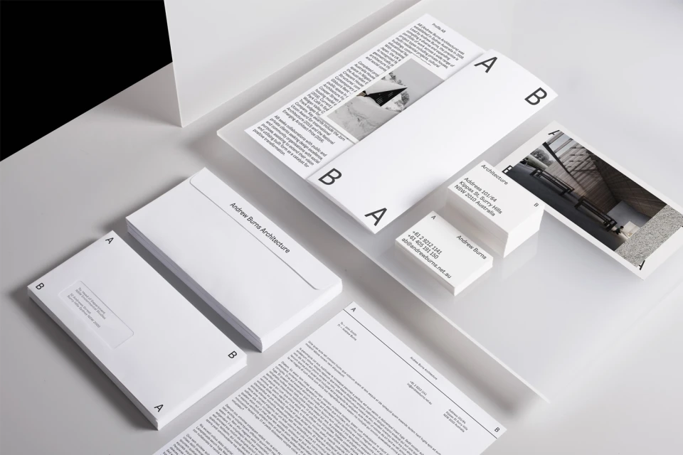
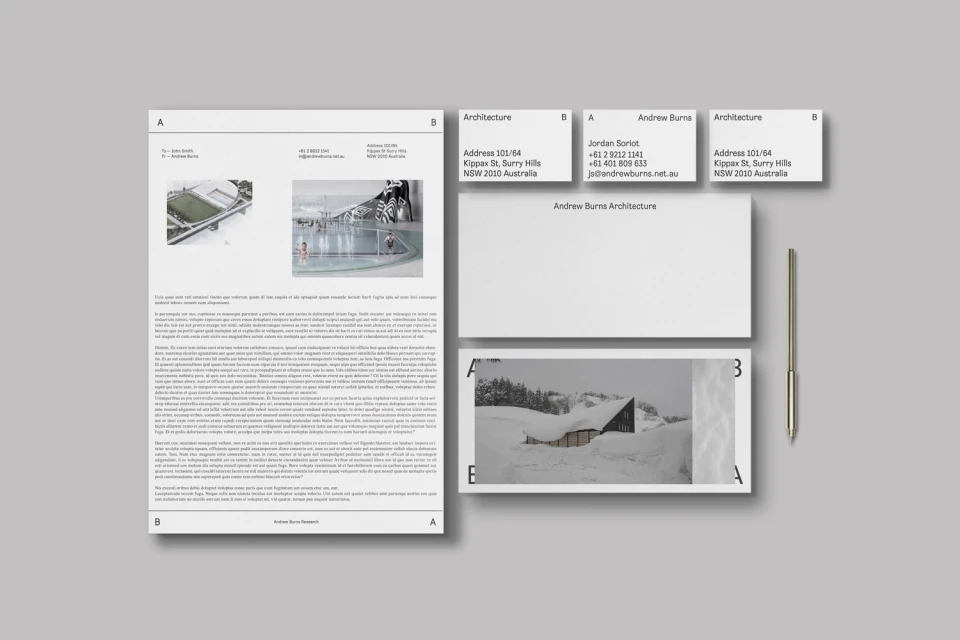
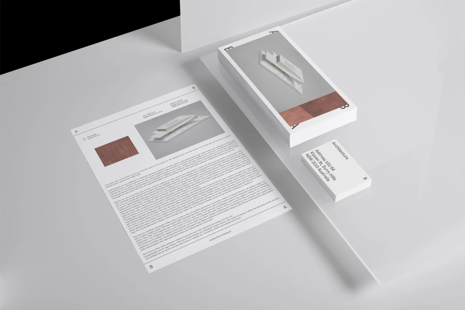
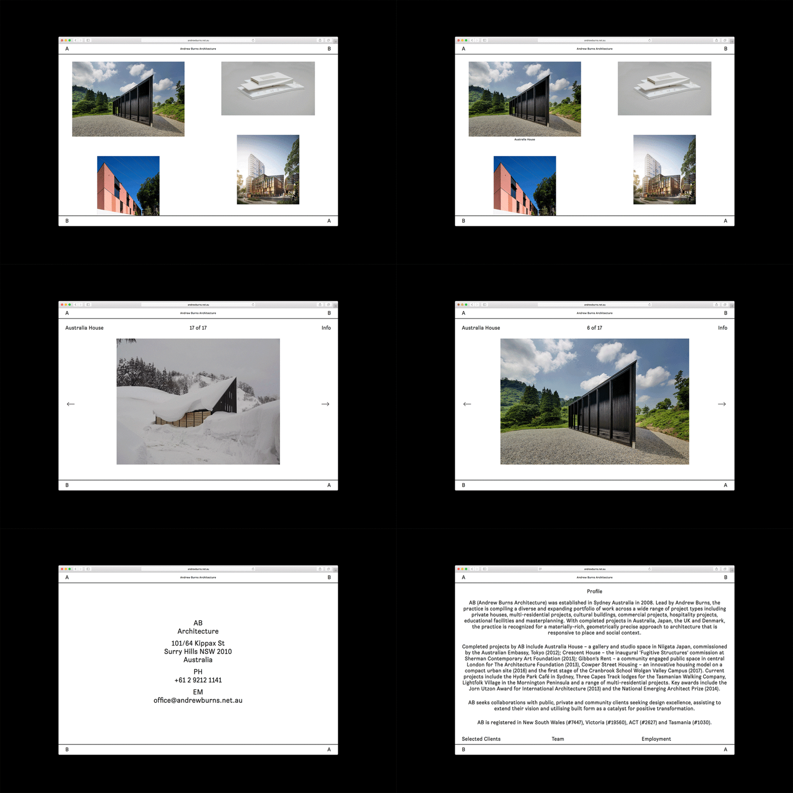
The brand identity for Andrew Burns Architecture serves as a masterclass in spatial precision and typographic restraint, effectively translating the structural logic of a high-end design firm into a tactile corporate identity system. Developed by SPGD, the project leans into a rigorous minimalist aesthetic, utilizing a disciplined black sans-serif typeface that mirrors the sharp, geometric silhouettes synonymous with modern architectural practice. Across a suite of professional stationery, including letterheads and business cards, the designers employ a consistent visual language that relies on the power of negative space and high-contrast composition. By incorporating subtle motifs such as the A and B letterforms, the identity feels both structural and bespoke, bridging the gap between print collateral and the built environment. The project further extends into the digital realm, with a refined UI illustration that presents a portfolio of structural works within clean, rectangular frames that echo the physical stationery’s proportions. Utilizing high-key studio strobe lighting and crisp print techniques, the imagery captures the clean edges of the paper stock to emphasize a sense of professional clarity. The resulting identity is a cohesive, highly organized system that captures the essence of the firm's Surry Hills practice, proving that architectural branding is most effective when it avoids excess in favor of a quiet, deliberate geometry that speaks directly to the firm's design ethos.
Horizontal, Commercial, Clean, Minimalist
Typography
Grey Seamless
E-commerce / Product
