
Faesal
Brand Identity
Dec 2017
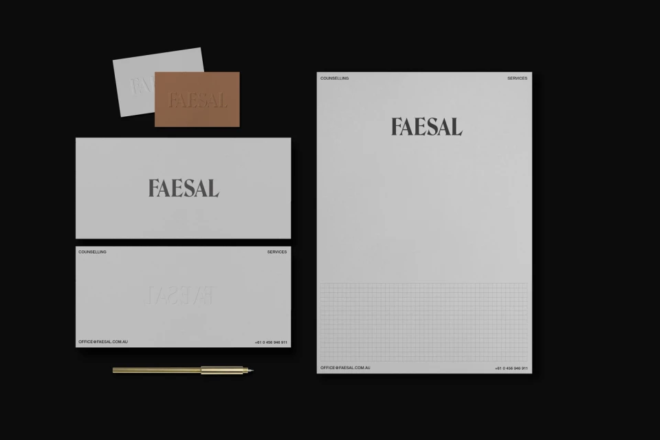
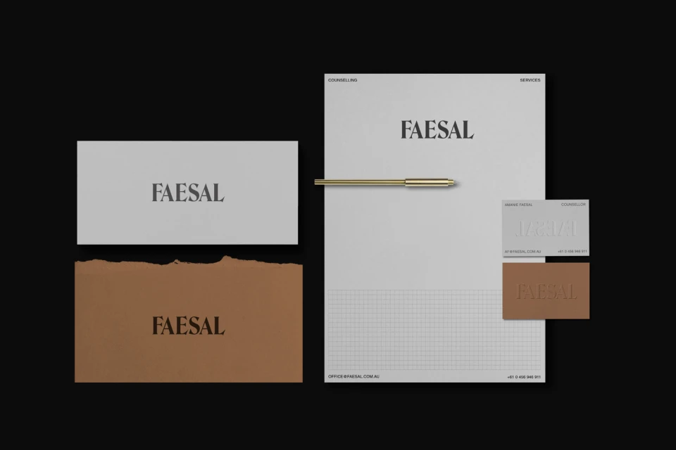
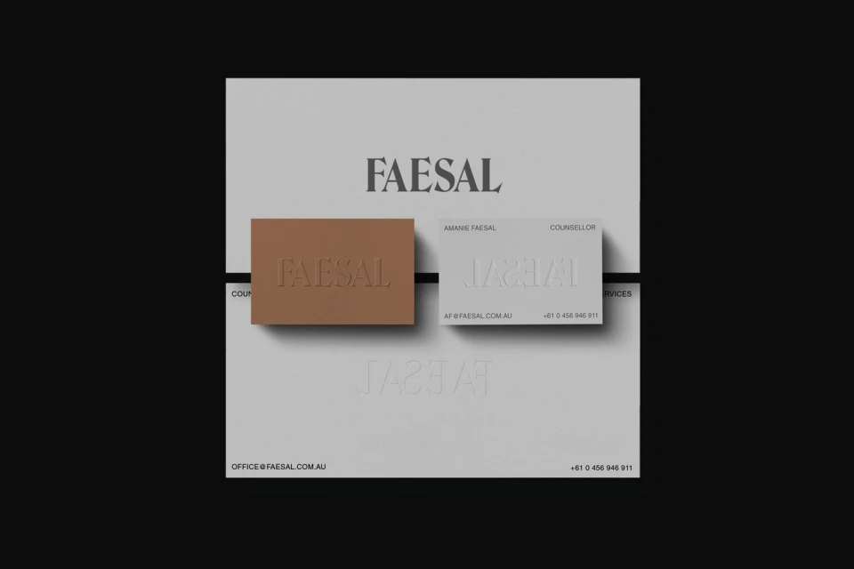
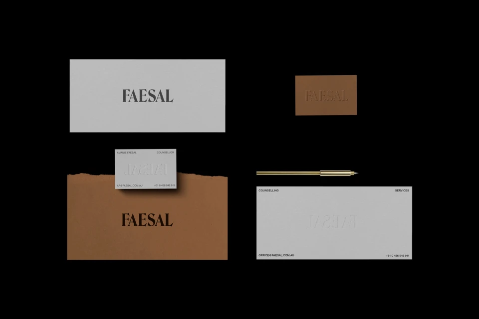
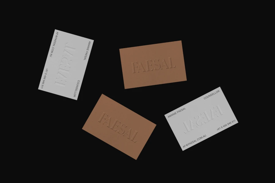
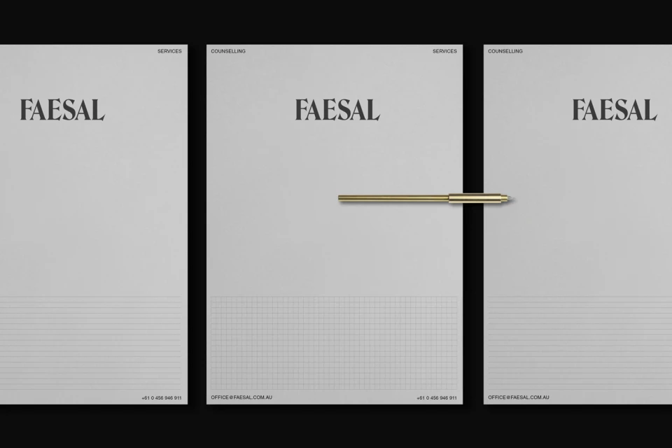
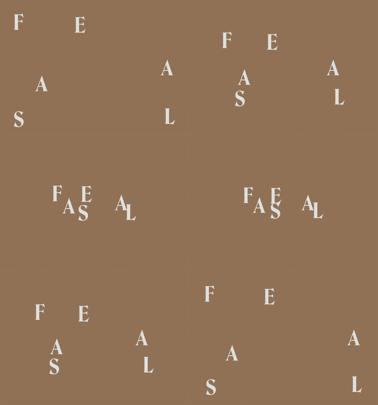
The new brand identity for Faesal Counselling Services by SPGD is a masterclass in restrained, high-end corporate design. By moving away from the often over-saturated visual tropes of the mental health sector, the agency has leaned into a sophisticated, minimalist aesthetic that feels both grounding and profoundly professional. The visual system is anchored by elegant serif typography that serves as the foundation for the entire suite, creating a cohesive narrative across business cards, letterheads, and envelopes. Through the expert use of studio strobe lighting, the project highlights a tactile, dimensional quality, particularly in the application of embossing and debossing techniques on matte tan and grey paper stocks. These subtle material choices elevate the work from standard stationery to a premium brand experience. The composition is driven by a deep, high-contrast color palette of muted earth tones and slate greys, set against a stark black backdrop that emphasizes the intentional use of negative space. This commercial identity project avoids unnecessary ornamentation, instead focusing on clarity and structured grid elements to convey trust. Whether through the crisp alignment of floating business cards or the playful, deconstructed arrangement of the logo on a flat-lay field, the design remains consistently intentional. The inclusion of a metallic gold-toned pen acts as a polished accent, signaling a brand that values precision and sophistication at every touchpoint.
Horizontal, Commercial, Clean, Minimalist
Typography, Emboss & Deboss
Solid Colour
