
Trit: Brand Identity



Jul 2019
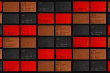
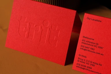
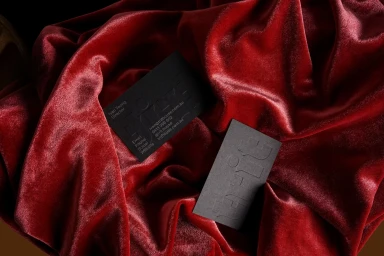
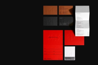
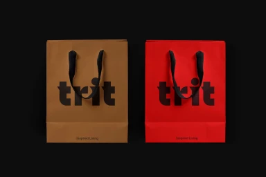
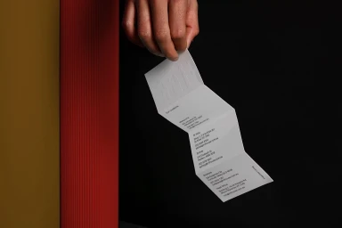
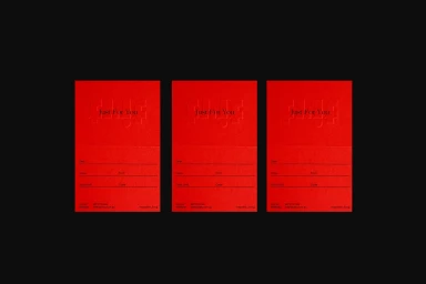
The brand identity for Trit, developed by SPGD, signals a sophisticated evolution within the e-commerce and retail sectors. This project leans into a rigorous minimalist aesthetic, utilizing a restrained, bold sans-serif typography to anchor the brand across a wide range of physical touchpoints. By prioritizing tactile experiences through the extensive use of emboss and deboss techniques, the design team creates a tangible sense of quality that transcends traditional corporate visual identity. The execution thrives on a high-contrast color palette—balancing stark black and white with vibrant bursts of red and muted earthy tones—which manifests across everything from storefront window treatments in Melbourne and St Kilda to refined, multi-folded stationery and shopping bags. Each piece of collateral is captured with soft light, a technique that highlights the rich material textures and the precise, symmetrical layout of the graphic design. By focusing on the structural interplay between matte paper stocks and deep shadows, the work creates a cinematic quality that elevates basic retail supplies into essential brand markers. The resulting visual system is consistent, clean, and highly disciplined, demonstrating how thoughtful typography and material selection can effectively communicate a brand promise of inspired living. It is a masterful exercise in restraint, where every element of the corporate identity serves to solidify the brand's presence in an increasingly crowded marketplace.
Horizontal, Commercial, Clean
Typography, Emboss & Deboss
Advertising Campaign
