
AP-DB
Brand Identity
Sep 2015
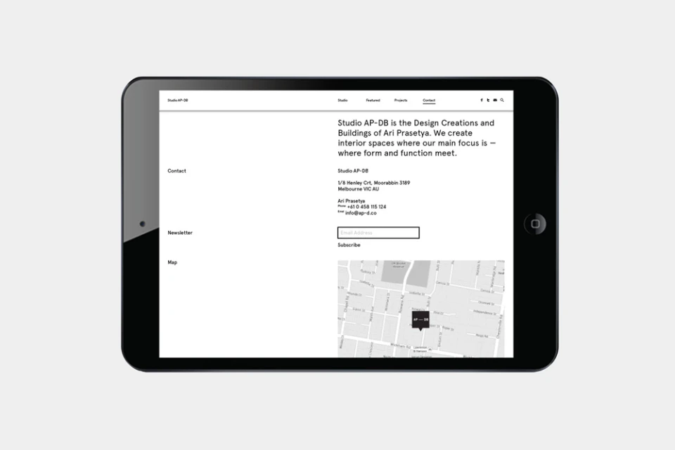
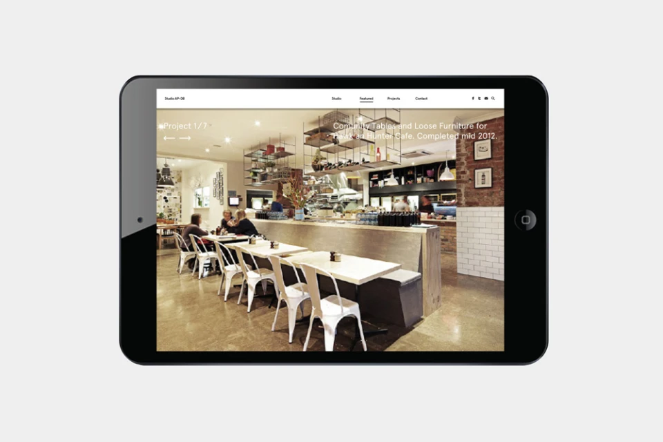
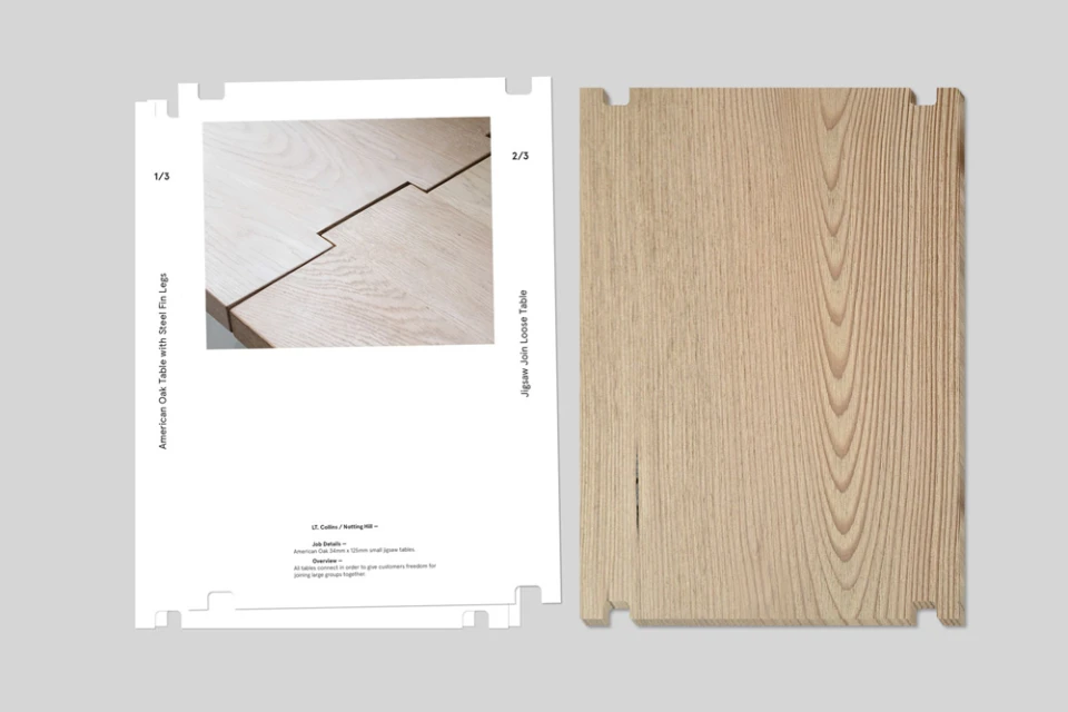
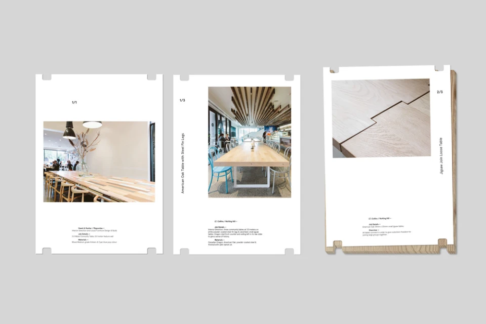
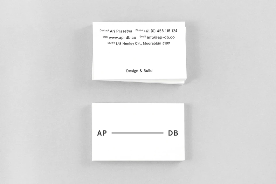
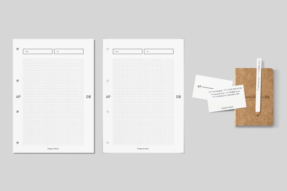
The brand identity for AP-DB manifests as a masterclass in architectural precision and commercial restraint, establishing a visual language that feels as structural as the furniture it showcases. Developed by SPGD, the project captures the essence of a design and build firm through a rigorous application of editorial minimalism and professional typography. By leaning into a monochromatic palette of stark white and high-contrast black, the identity system communicates technical expertise without unnecessary embellishment. The collateral extends this philosophy across a suite of corporate stationery, business cards, and digital interface designs, each element reflecting a commitment to order and clarity. Central to the brand story is the Jigsaw Join table system, which serves as both a physical product and a symbolic cornerstone for the firm’s approach to modular assembly and material integrity. Through a series of UI illustrations and technical specification sheets, the identity bridges the gap between raw natural textures, like American oak, and the clean, industrial landscapes of modern restaurant design. Every touchpoint, from the grid-based stationery to the deliberate overhead product photography, underscores a cohesive narrative of craft. The result is a sophisticated, highly disciplined aesthetic that positions AP-DB as a leader in bespoke interior design, where the beauty of the build is inextricably linked to the intentionality of the brand's graphic presentation.
Horizontal, Commercial, Clean, Minimalist
