
Ricci Bloch Architects
Brand Identity

Jun 2017
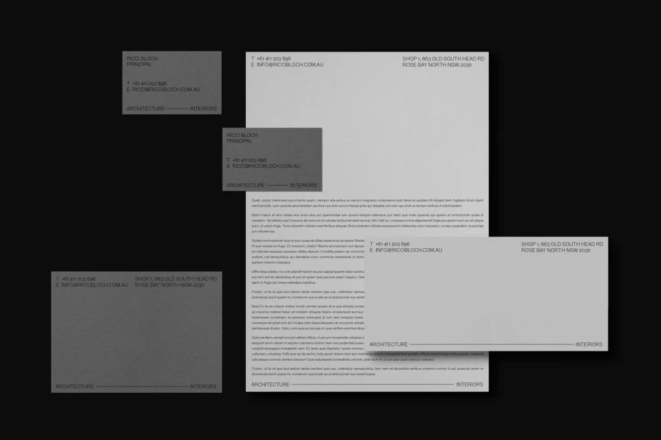
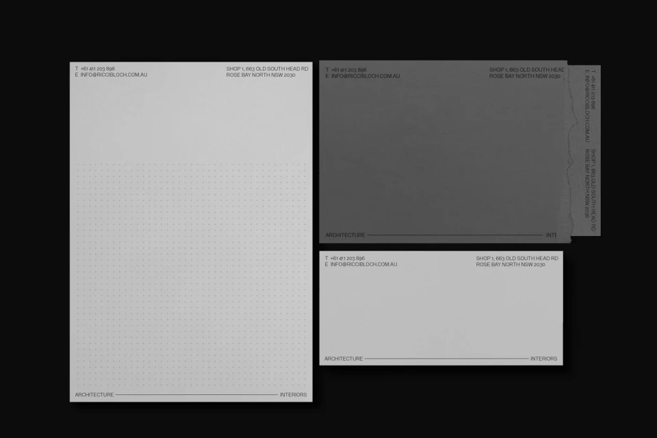
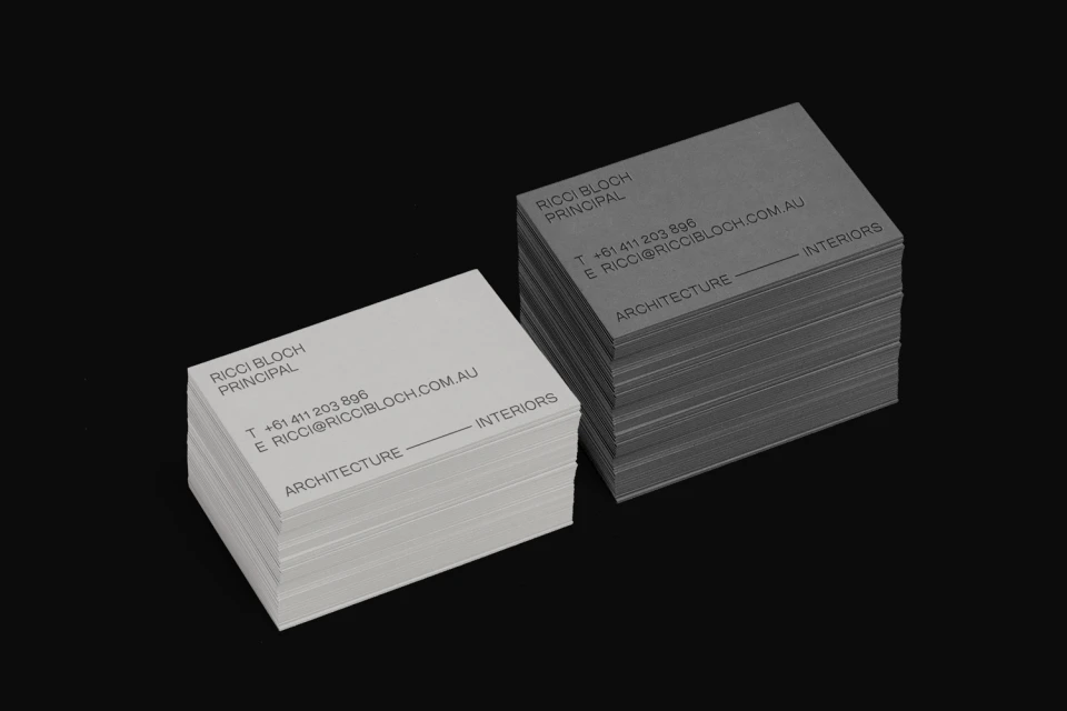
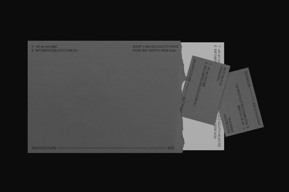
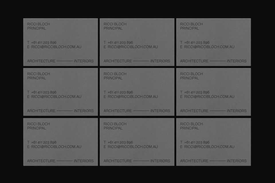
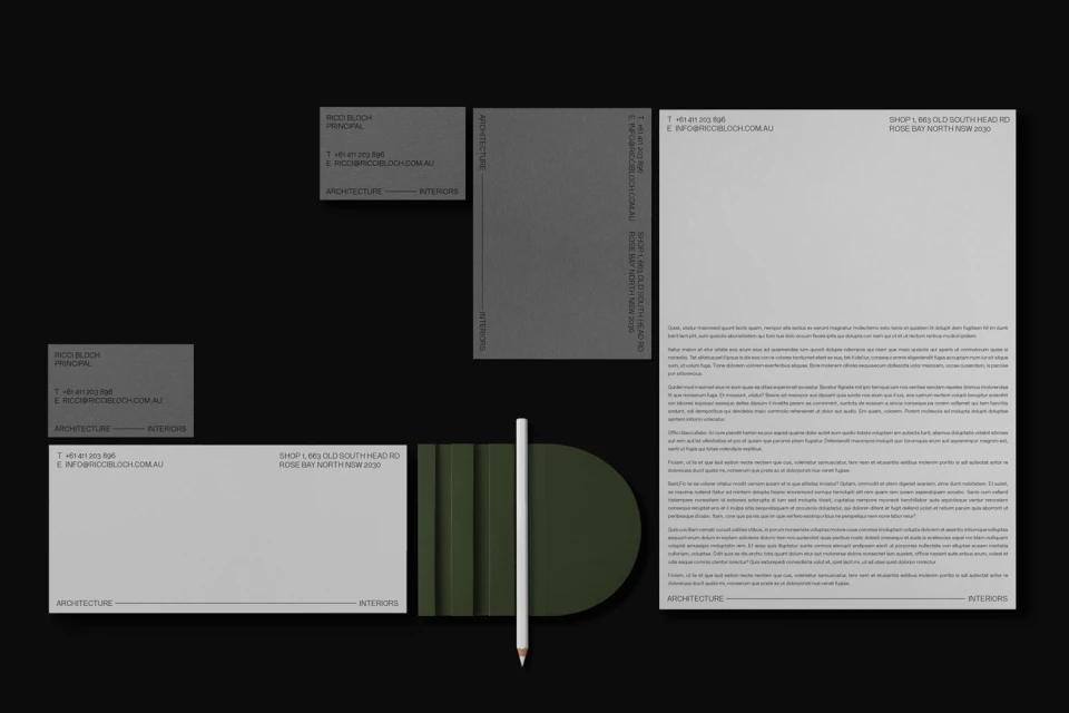
For Ricci Bloch Architects, the task of crafting a brand identity required a visual language that mirrored the precision and structural integrity of the firm’s own built work. Executed with a rigorous commitment to minimalist design, the identity leans into a monochromatic palette, utilizing high-contrast typography and negative space to establish an authoritative presence within the real estate and architecture sector. Developed by SPGD, the graphic design system is defined by its clean, sans-serif letterforms and a methodical use of layered grid systems, creating a tactile and professional ecosystem across stationery and business collateral. By incorporating elements like subtle dotted patterns and utilitarian geometric motifs, the identity feels less like traditional marketing and more like an extension of the architectural practice itself. The application of studio strobe lighting in the presentation imagery highlights the premium card stocks and the raw, deliberate materiality of the brand assets. Throughout, the project captures an essential tension between the stark black backgrounds and the delicate grey-and-white print surfaces, resulting in a cohesive, modern visual shorthand. This approach not only elevates the firm’s positioning in the competitive landscape of property and interiors but also reinforces a brand ethos centered on clarity, professional balance, and contemporary restraint, ensuring every interaction feels as meticulously considered as a final architectural blueprint.
Horizontal, Commercial, Minimalist, Clean
Typography
Black Seamless
Advertising Campaign
