
Alchemy: Brand Identity



Apr 2020
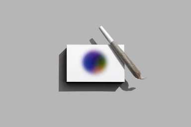
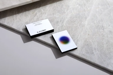
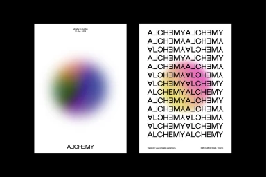
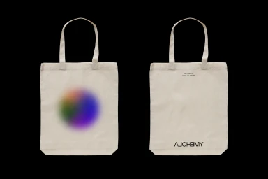
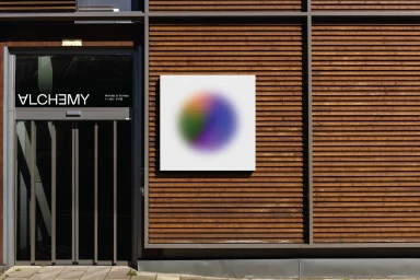
The brand identity project for Alchemy serves as a masterclass in minimalist design, balancing clinical precision with an ethereal, dreamlike visual vocabulary. By masterfully executing a corporate branding system, the team creates an ecosystem where clean, architectural structure meets the fluid, organic energy of soft-focus gradients. The work relies heavily on the tension between bold, sans-serif typography and vibrant, airbrushed color transitions—elements that appear across everything from sophisticated business stationery to high-end retail signage. Through the lens of photographer Paul Weeks, the identity is presented in a commercial, studio-lit aesthetic that emphasizes premium materiality and geometric clarity. Underline Studio anchors the project with a rigorous, grid-based approach to typography, ensuring that the brand remains legible yet evocative, whether displayed on a textured cotton tote or a sleek marble slab. The visual storytelling leans into the interplay of light and shadow, utilizing hard-edged lighting to ground the ethereal graphics in physical reality. With production support from Flash Reproductions, the project demonstrates how technical finesse can elevate everyday collateral into a cohesive and contemporary visual language. This identity effectively bridges the gap between traditional corporate aesthetics and modern artistic expression, utilizing UI illustration techniques and deliberate negative space to craft a brand presence that feels both permanent and curiously weightless, proving that a singular concept can be remarkably transformative.
Horizontal, Commercial, Clean, Minimalist


