
Halo Brewery
Brand Identity
Jan 2018
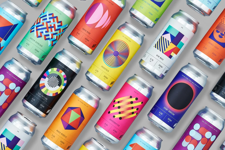
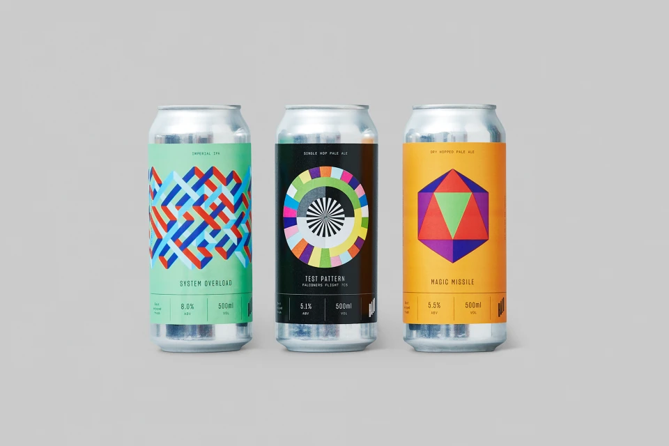
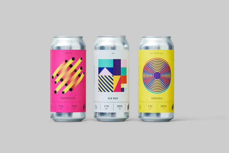
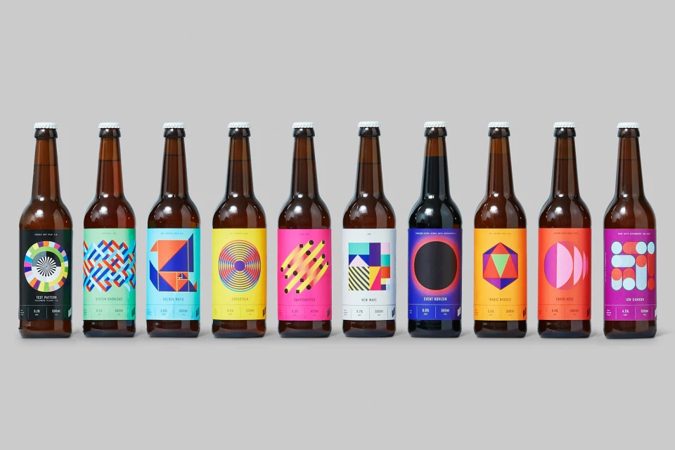
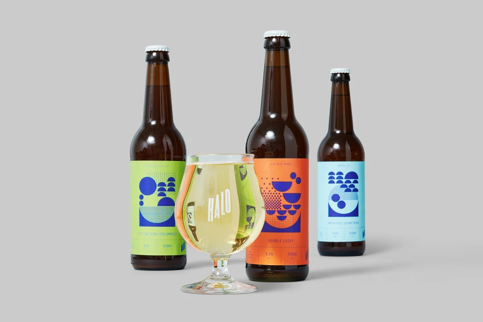
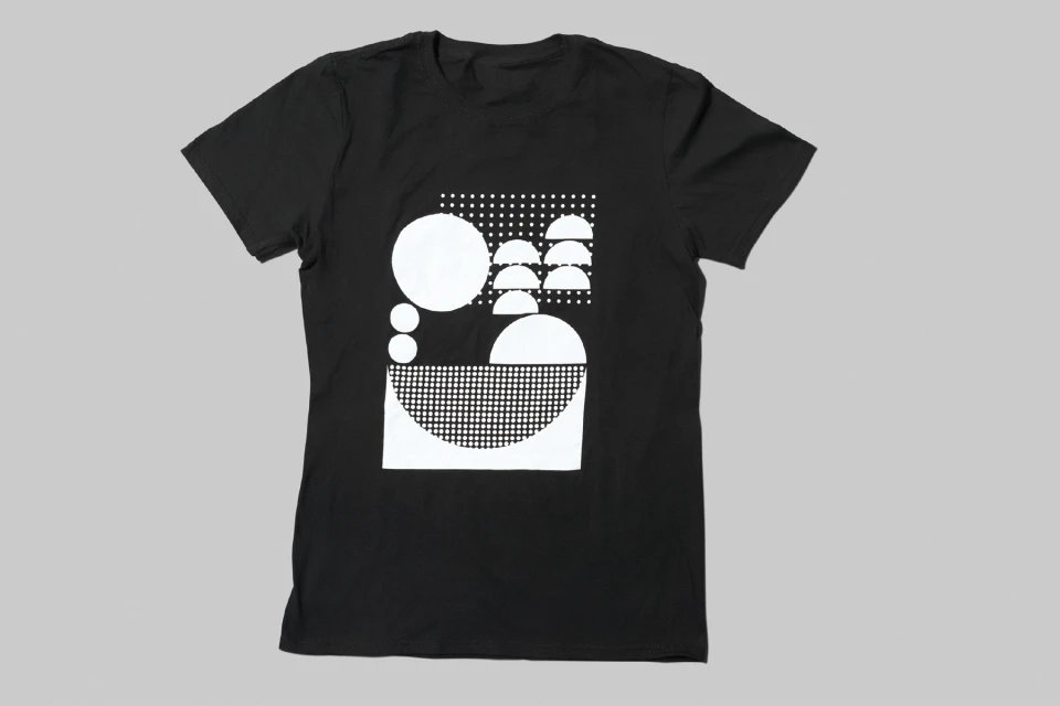
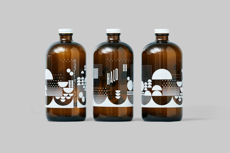
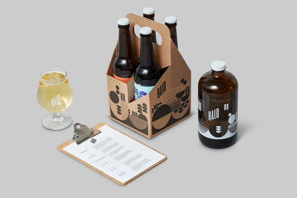
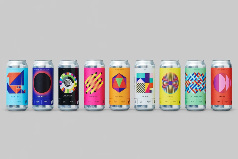
In the crowded landscape of independent craft breweries, Halo Brewery distinguishes itself through a rigorous, high-concept brand identity that prioritizes graphic precision over traditional industry tropes. Developed in collaboration with Underline Studio, the brewery’s visual language leans heavily into editorial minimalism, utilizing a sophisticated system of geometric abstraction that feels as much at home in a design gallery as it does on a retail shelf. Across a diverse range of touchpoints, from sleek aluminum cans and amber glass bottles to screen-printed apparel and collateral menus, the project masterfully employs studio strobe lighting to emphasize the structural clarity of the packaging. The identity is defined by a bold, sans-serif typography that grounds the various abstract patterns, optical illusions, and vibrant vector illustrations featured on the labels. By maintaining a uniform, light gray studio backdrop throughout their product photography, Halo Brewery achieves a cohesive brand architecture that emphasizes consistency without sacrificing individual variety. This systematic approach—incorporating intricate dot-matrix patterns, concentric circles, and primary color palettes—creates a rhythmic, organized visual display. The resulting aesthetic is sharp and highly legible, reinforcing the brand's commitment to modern design standards while successfully elevating the craft beer experience through a refined, analytical lens that elevates the humble beverage into a canvas for contemporary creative expression.
Horizontal, Commercial, Clean
Alcoholic Beverages
Grey Seamless
E-commerce / Product
