
AkzoNobel: Brand Identity


Apr 2021
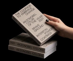
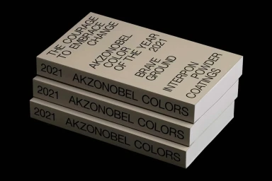
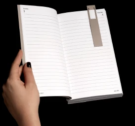
This brand identity project for AkzoNobel centers on a 400-page publication and planner set, designed to translate the company's annual color trends into a physical, tactile format. The design leans into minimalist aesthetics, utilizing a clean, monochromatic color palette and precise typographic arrangements to establish a structured editorial presence. Graphic designers Georgia Harizani and Filippos Fragkogiannis led the development of the identity, focusing on the interplay between bold sans-serif text and the material quality of the paper. The project features Curious Collection paper stock, with the publication measuring 125mm x 215mm to maintain a functional, handheld scale. The execution relies on sharp, clean studio photography to emphasize the paper texture and the specific grid-based layout.
Horizontal, Commercial, Clean, Minimalist
Typography
Black Seamless


