
Bianca Sciuto: Brand Identity


Apr 2021
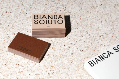
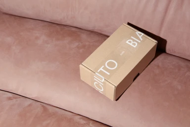
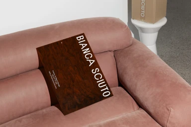
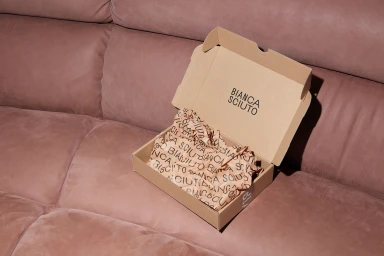
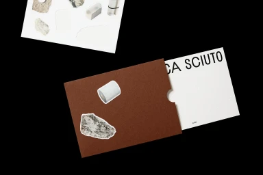
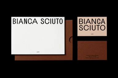
This brand identity project for Bianca Sciuto centers on a cohesive suite of stationery and packaging collateral. Through a clean, minimalist design approach, the work prioritizes tactile paper stocks and premium print finishing to define the brand's visual presence. Graphic design by Both establishes a recurring typographic rhythm, paired with material selections from Curious Collection, Keaykolour, and Gmund, and expert fabrication by Jot Press. Photographer Shelley Horan captures the identity across various studio environments, utilizing hard directional lighting and natural light to emphasize the depth of the debossed edges and textured paper surfaces. The imagery transitions between stark black backgrounds and warmer, domestic settings, highlighting the interplay between sharp typography and curated material palettes.
Horizontal, Commercial, Clean


