
Cuozzo Fleming: Brand Identity



Oct 2020
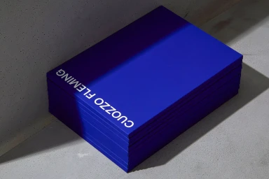
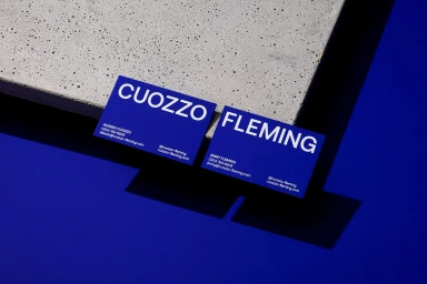
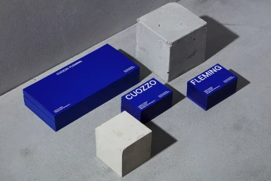
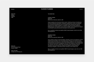
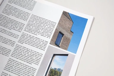
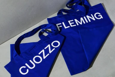
Cuozzo Fleming, an architectural firm, introduces a comprehensive brand identity system that translates structural precision into visual communication. The project centers on a minimalist aesthetic, utilizing a palette of vivid blue and stark white to establish a modern corporate presence across various touchpoints. The design identity relies on clean lines, high-contrast typography, and deliberate geometric arrangements to reflect the firm’s architectural focus. Materiality plays a central role in the collateral, with the design team utilizing Curious Collection paper stock to enhance the tactile quality of the stationery and printed materials. The system spans digital and physical formats, including tote bags, editorial layouts, and a web portfolio, maintaining consistency through hard-light photography and a modular grid structure.
Horizontal, Commercial, Clean, Minimalist

