
AKT: Brand Identity


Nov 2019
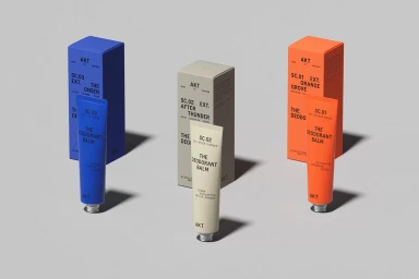
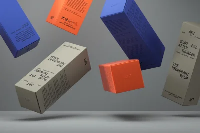
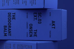
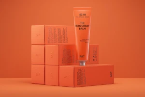
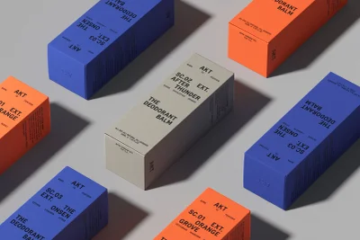
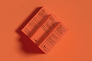
The brand identity for AKT marks a sophisticated evolution in the skincare and beauty sector, positioning the brand as a modern staple in premium personal care. Through a series of highly structured commercial assets, the project emphasizes the tactile nature of its product line, showcasing deodorant balms that bridge the gap between utilitarian performance and elevated design. The visual language centers on a minimalist aesthetic, characterized by bold sans-serif typography and a deliberate, high-contrast color palette of electric blue, vibrant orange, and muted beige. Two Times Elliott leads the graphic design effort, ensuring that every element—from the matte textures of the packaging to the precise debossed logos—reinforces a clean, clinical, and intentional brand identity. By utilizing techniques such as beauty light and high-key studio setups, the imagery achieves a sense of geometric harmony. The composition is further enhanced by subtle, elongated shadows that provide depth, transforming simple packshots into a professional showcase of 100% recyclable materials. By leaning into a monochromatic color-blocking approach, the project communicates a consistent, high-end narrative that feels both accessible and distinctly elevated. This comprehensive identity work captures the intersection of contemporary graphic design and product-focused marketing, establishing a compelling, versatile presence that feels perfectly suited for the demands of modern luxury skincare retail.
Horizontal, Commercial, Clean, Minimalist
3D render / CGI
E-commerce / Product
