
Disrepute
Brand Identity
Aug 2017
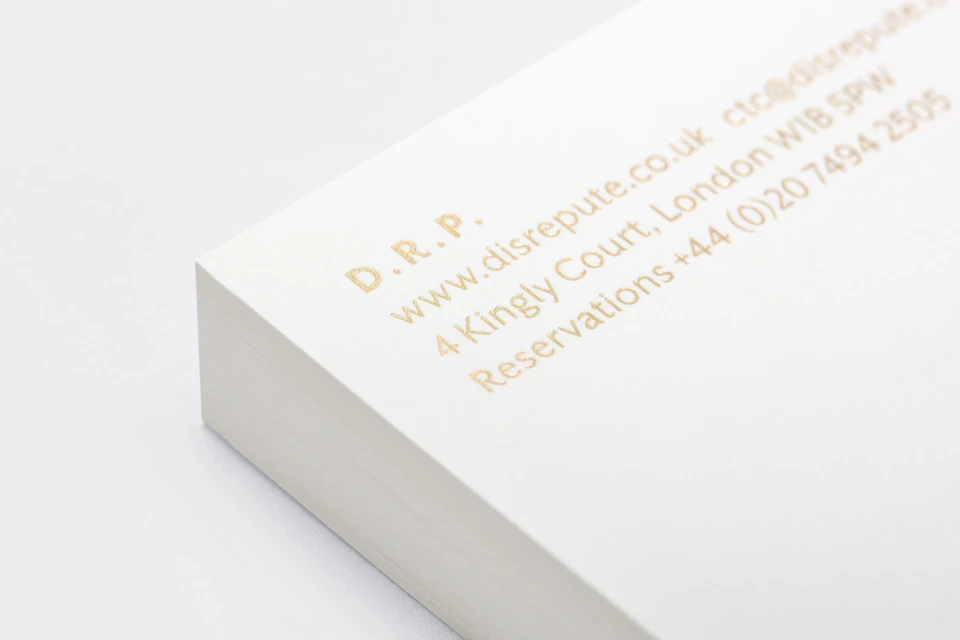
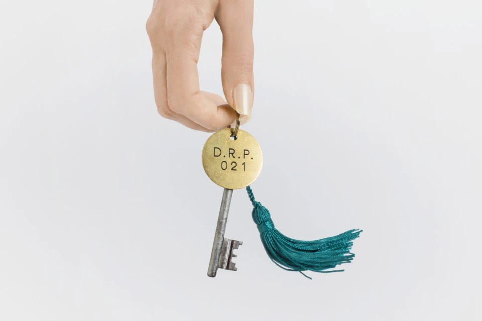
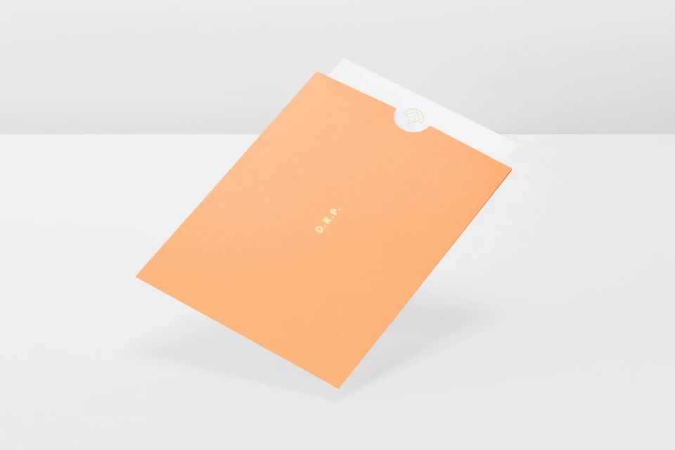
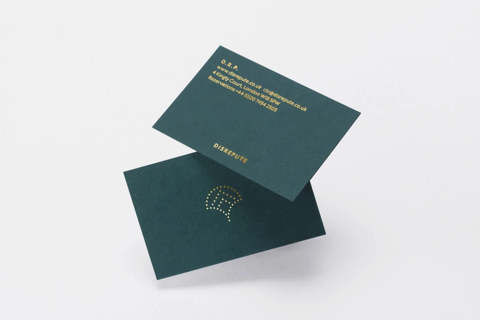
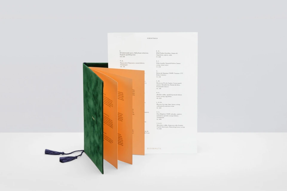
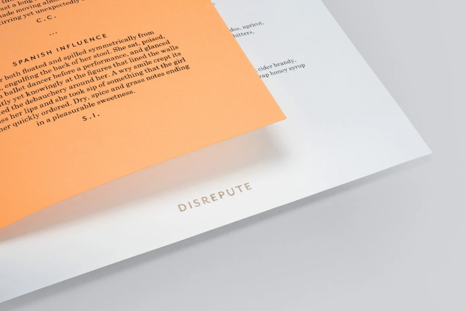
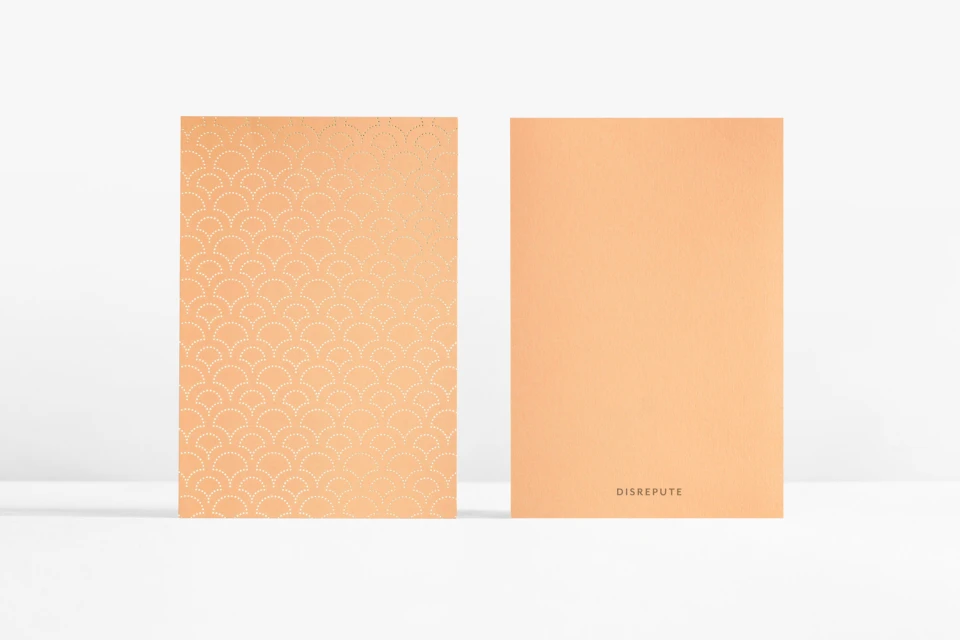
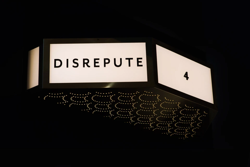
The brand identity for Disrepute, executed with design precision by Two Times Elliott, serves as a masterclass in tactile luxury and minimalist composition. Through a cohesive visual language, the project spans a diverse array of commercial collateral, from high-end cocktail menu design to custom illuminated signage. The work leans into a sophisticated, editorial design approach that balances bold typography with the deliberate use of negative space, creating a professional and inviting aesthetic. A focus on material exploration defines the identity, where the contrast of deep matte textures—such as dark green velvet and heavy, textured teal cardstock—meets the reflective elegance of gold foil-stamping. By integrating subtle accents like vibrant teal silk tassels and warm orange paper inserts, the branding achieves a distinctive, layered personality. Utilizing a blend of high-key studio strobe lighting and macro photography techniques, the presentation highlights the granular details of the print process, emphasizing the premium quality of the stationery. Whether through the clean, sharp lines of sans-serif lettering or the architectural presence of the nighttime signage, the project succeeds in establishing an immersive brand presence. This collection of assets reads as a deliberate exercise in restrained, impactful corporate design, ensuring that every element—from the smallest business card to the structural exterior—feels intentional, highly crafted, and deeply aligned with a refined, contemporary narrative.
Horizontal, Commercial, Clean, Minimalist
White Seamless
Advertising Campaign
