
Kish Kash
Brand Identity
Nov 2018
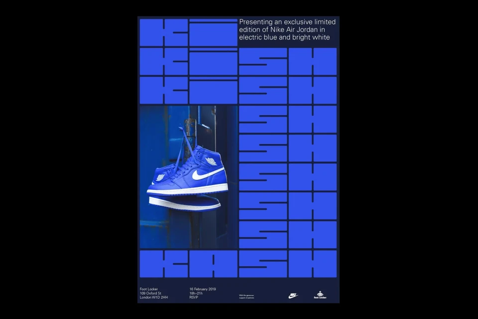
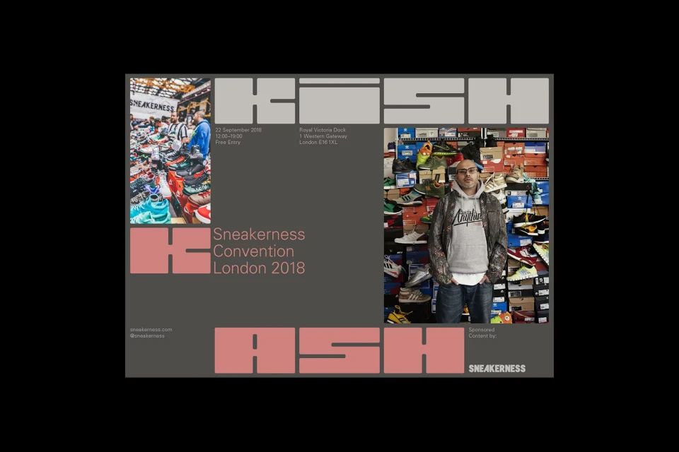
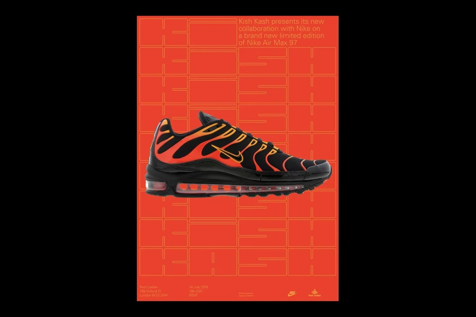
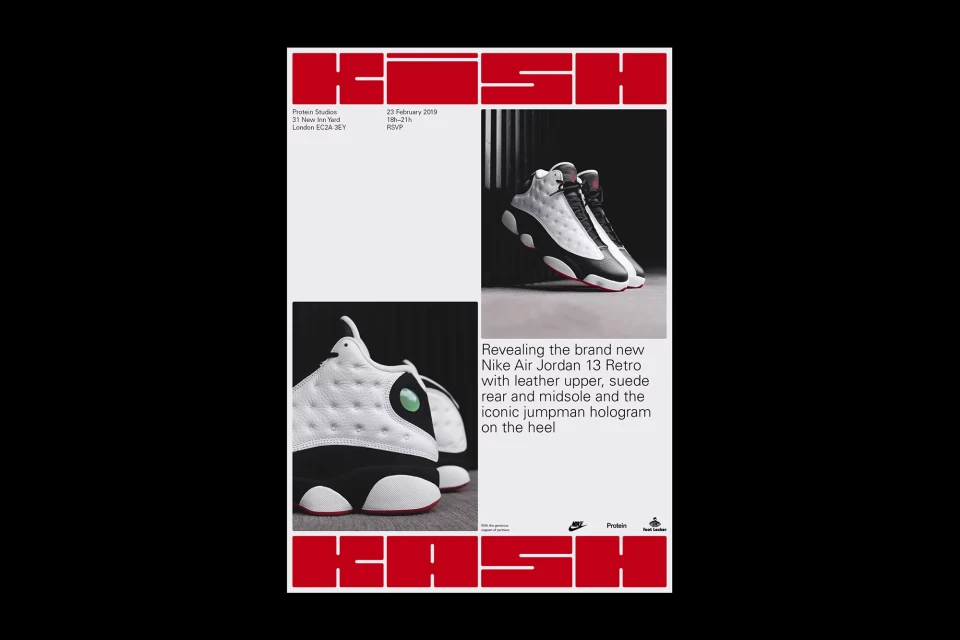
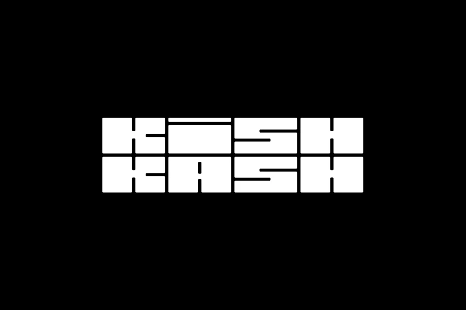
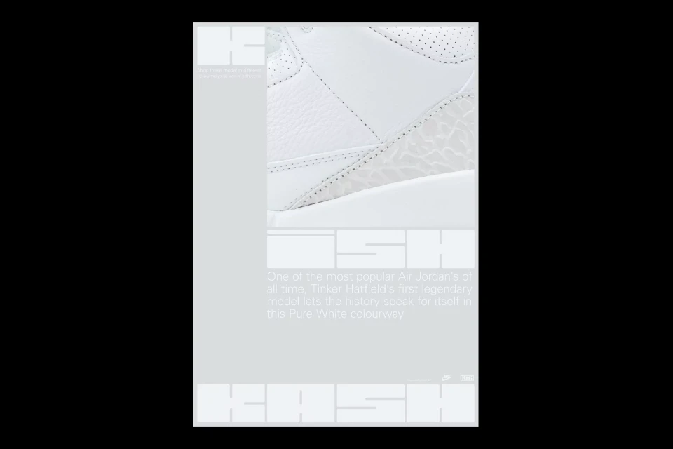
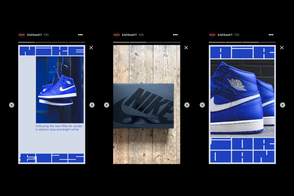
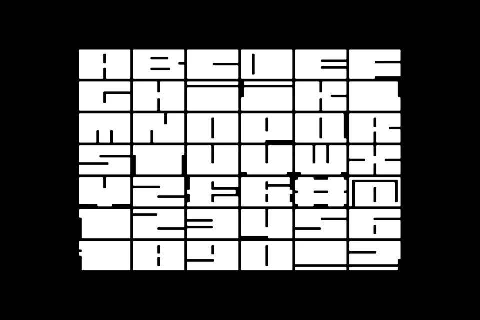
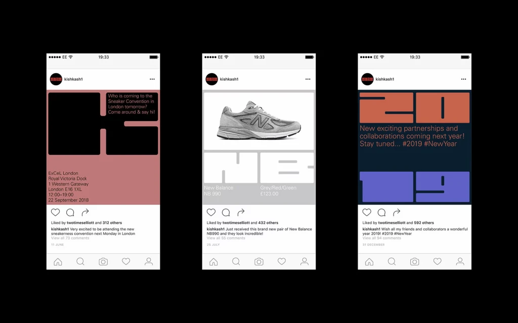
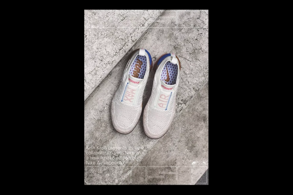
The brand identity for Kish Kash serves as a masterclass in urban graphic design, effectively bridging the gap between high-performance footwear and contemporary street culture. Developed by Two Times Elliott, this comprehensive identity system leans into a bold, architectural language that treats sneakers not merely as consumer products, but as geometric artifacts. Across a series of promotional assets, the project utilizes a rigorous grid system and a distinctive, blocky, geometric typeface to anchor its visual narrative. By balancing high-contrast monochromatic palettes with occasional bursts of vibrant, saturated color, the designers have established a flexible aesthetic that translates seamlessly from physical posters and event collateral to digital UI illustration and mobile interfaces. The work channels a sense of editorial minimalism, where the focus remains sharp on the structural integrity of the product, whether through macro-focused photography or calculated, systematic typography. This modular approach allows for a clean, consistent feed-based presence that feels both authoritative and accessible. By integrating utilitarian design cues with a refined sense of spacing and scale, the Kish Kash brand identity reinforces a sophisticated commercial aesthetic that feels inherently modern. The project highlights a mastery of typographic precision, creating a cohesive visual language that functions as a structural framework for sneaker culture events and exclusive collaborations alike, establishing a distinct, memorable presence within a crowded marketplace.
Vertical, Graphic
Typography
Advertising Campaign
