
Oro: Brand Identity




Sep 2026
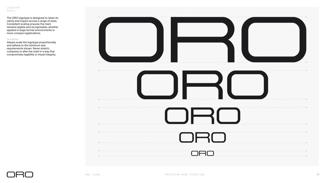
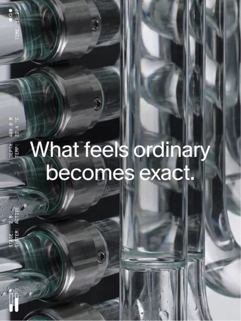
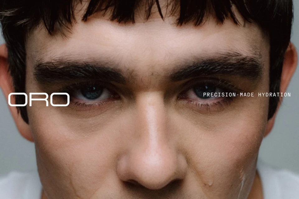
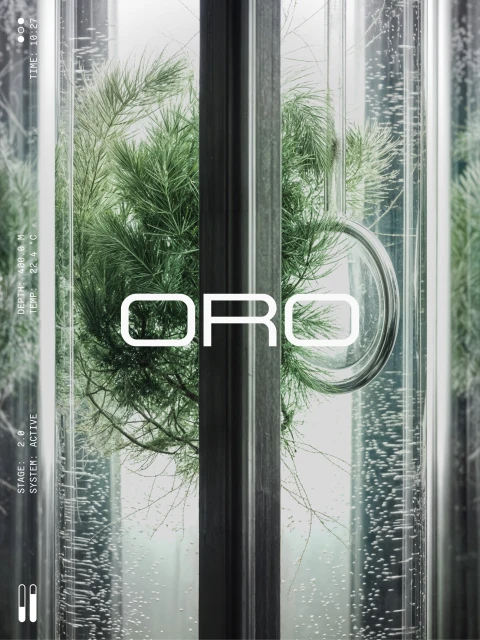
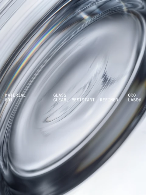
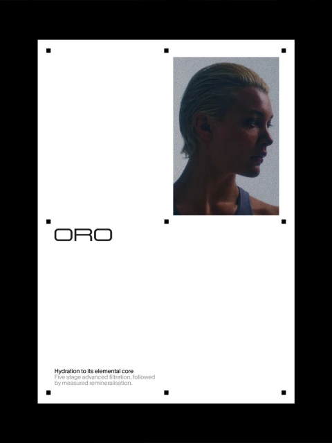
Two Times Elliott delivers a comprehensive brand identity for Oro, a project defined by its clinical precision and minimalist structural geometry. The visual system bridges the organic and the synthetic, layering digital interface readouts and technical data metrics over macro, nature-inspired imagery such as moss, lichen, and water-droplet-strewn glass. The project incorporates a restrained, monochromatic color palette and sharp sans-serif typography. Through the use of 3D render / CGI techniques, the identity explores industrial themes, focusing on refined materials and mechanical components. This aesthetic is mirrored in the editorial-style layout, which balances heavy white space with structured grids and precise alignment marks to convey a sense of technical authority. Additional design contributions were provided by .raw, with the resulting work highlighting the integration of sleek product photography and typographic experimentation.
Clean, Vertical

