
AIZOME: Brand Identity

May 2023
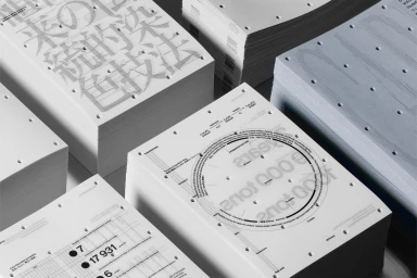
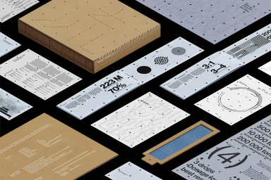
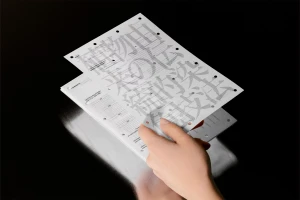
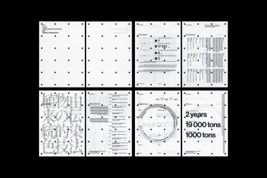
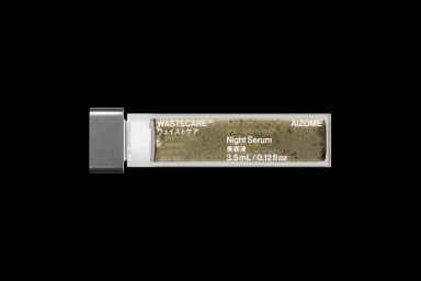
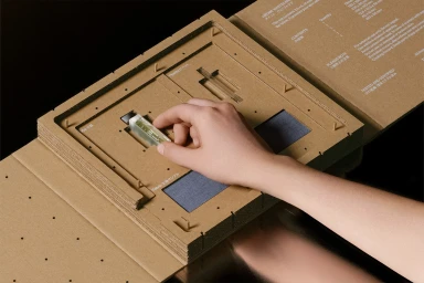
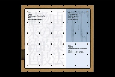
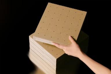
AIZOME’s brand identity project establishes a visual language centered on structural clarity, material tactility, and technical precision. Developed by Serviceplan and Workbyworks, the system integrates minimalist graphic design with sustainable packaging, utilizing natural kraft textures and perforated paper elements to reflect the brand's analytical approach to traditional dyeing and waste reduction. Across print collateral and product packaging, the identity employs a monochromatic palette accented by pale blues and earthy tones. The work features intricate typographic layouts, data visualizations, and systematic grid-based compositions that emphasize the project's experimental nature. Motion graphics and 3D rendering further extend this identity, applying precise vector line work and clean studio lighting to define the brand's clinical yet natural aesthetic.
Horizontal, Commercial, Minimalist, Clean
Typography
Advertising Campaign

