Logo
  • Home
  • ·Media
  • ·AIZOME Brand Identity and Packaging Design
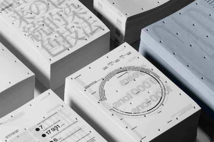
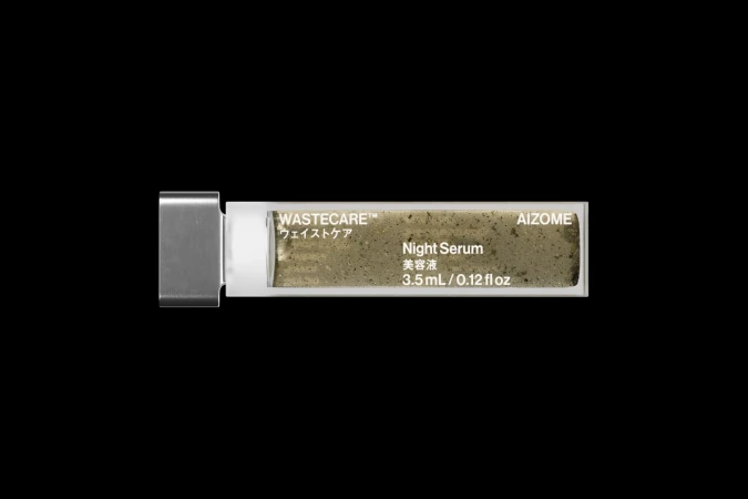
AIZOME brand identity packaging design featuring perforated cardboard and typographic panels with Japanese and English text

AIZOME Brand Identity 2023

About

This graphic design piece presents the brand identity for AIZOME, created by Serviceplan and Workbyworks. The composition features a structured presentation layout enclosed within a perforated brown cardboard frame. Inside, white and pale blue panels display clean typographic elements in both English and Japanese characters, detailing traditional plant-based dyeing and waste reduction concepts. The overall aesthetic is minimal, precise, and systematic.

Brand

Project

Keywords

Credits

Styles

Techniques

Industries

Background

Paper Texture

Context

Advertising Campaign
Similar media
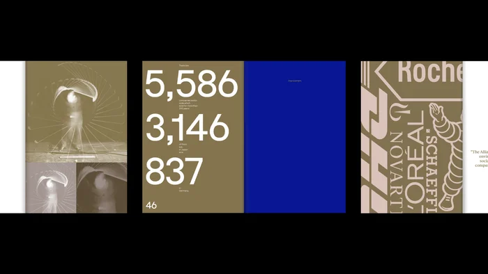
Editorial spread with infographics, numbers, and graphic branding elements by NAMENAME Creative Partners
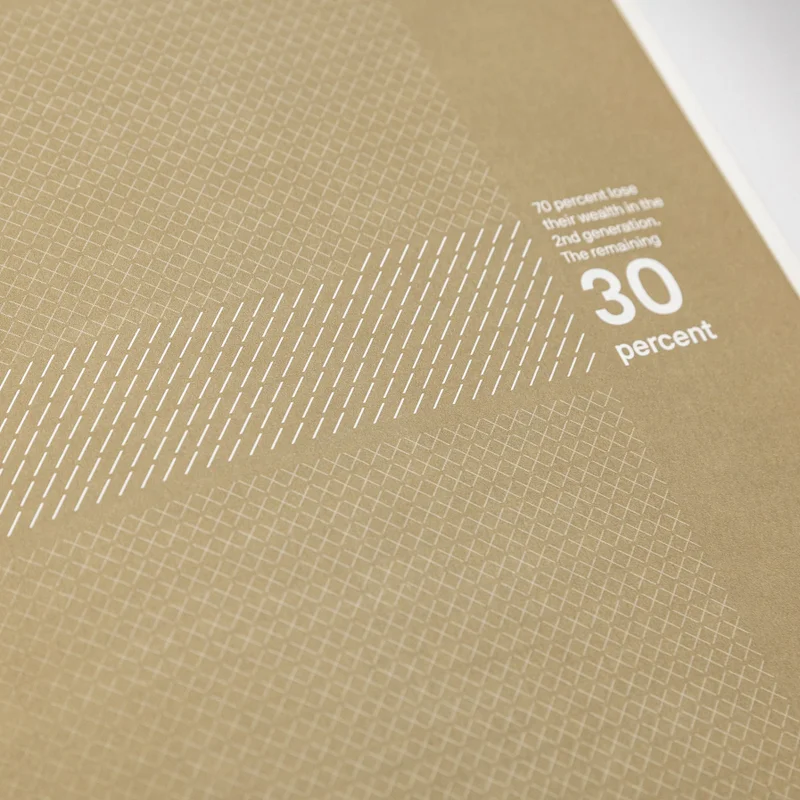
Close-up shot of brown textured paper with white typography and geometric pattern details by NAMENAME Creative Partners
Black woman wearing a white patterned top and black trousers behind vertical fluted glass against a blue background
White paper pad secured by three metallic binder clips against a plain white background
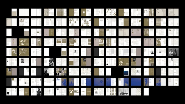
Grid display of editorial book spreads and magazine layouts featuring typography and photographic imagery by NAMENAME Creative Partners
Silhouette of a person wearing a wide-brimmed hat next to hanging fabric panels
Black and white photograph of tree branches against a bright sky, mounted on a textured checkered background.
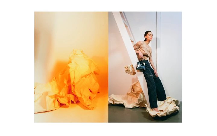
Model seated on a white ladder holding a black handbag next to a crumpled yellow paper sculpture
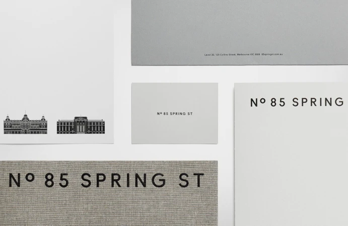
Flat lay of stationery and business cards featuring the text 85 Spring St against a clean white background
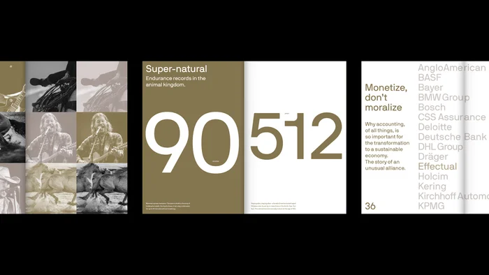
Editorial layout featuring bold typography, large numerals, and muted earthy tones by NAMENAME Creative Partners
A completely black image frame with no visible subjects, objects, or details.
Solid black frame with no visible content or detail