
Brand
ProjectBrand Identity
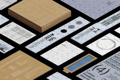
AIZOME Brand Identity 2023
Associated creatives


Tags
Description
This flat lay composition showcases the brand identity for AIZOME, featuring a collection of printed collateral, informational cards, and a bound box made from natural kraft paper. The layouts incorporate technical data graphics, typography, and perforated alignment marks across pale blue, white, and brown paper stocks. Created by Serviceplan and Workbyworks, the presentation highlights sustainable packaging and meticulous graphic design. The overhead perspective emphasizes the structured arrangement of documentation and tactile materials.