
Brand
ProjectBrand Identity
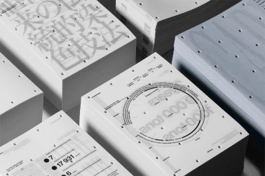
AIZOME Brand Identity 2023
Associated creatives


Tags
Description
This graphic design project for AIZOME features precise, high-concept brand identity collateral presented through stacked piles of perforated white paper. The printed materials showcase intricate typographic layouts, technical diagrams, and circular process charts. The clean, minimalist composition highlights fine paper textures, crisp black typography, and subtle blue-tinted stacks. Created by Serviceplan and Workbyworks, the work emphasizes structural clarity and material tactility in contemporary graphic design.