
Brand
ProjectBrand Identity
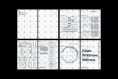
AIZOME Brand Identity 2023
Associated creatives


Tags
Description
This project showcases the brand identity for AIZOME, created by Serviceplan and Workbyworks. The composition features a grid of white sheets marked with black binder holes along the edges. The pages display a combination of structured typography, data visualisations, numerical statistics, and traditional text in Japanese and English. Clean lines and a monochromatic palette emphasize the analytical and experimental nature of the design.