
BrandAIGA
ProjectBrand Identity
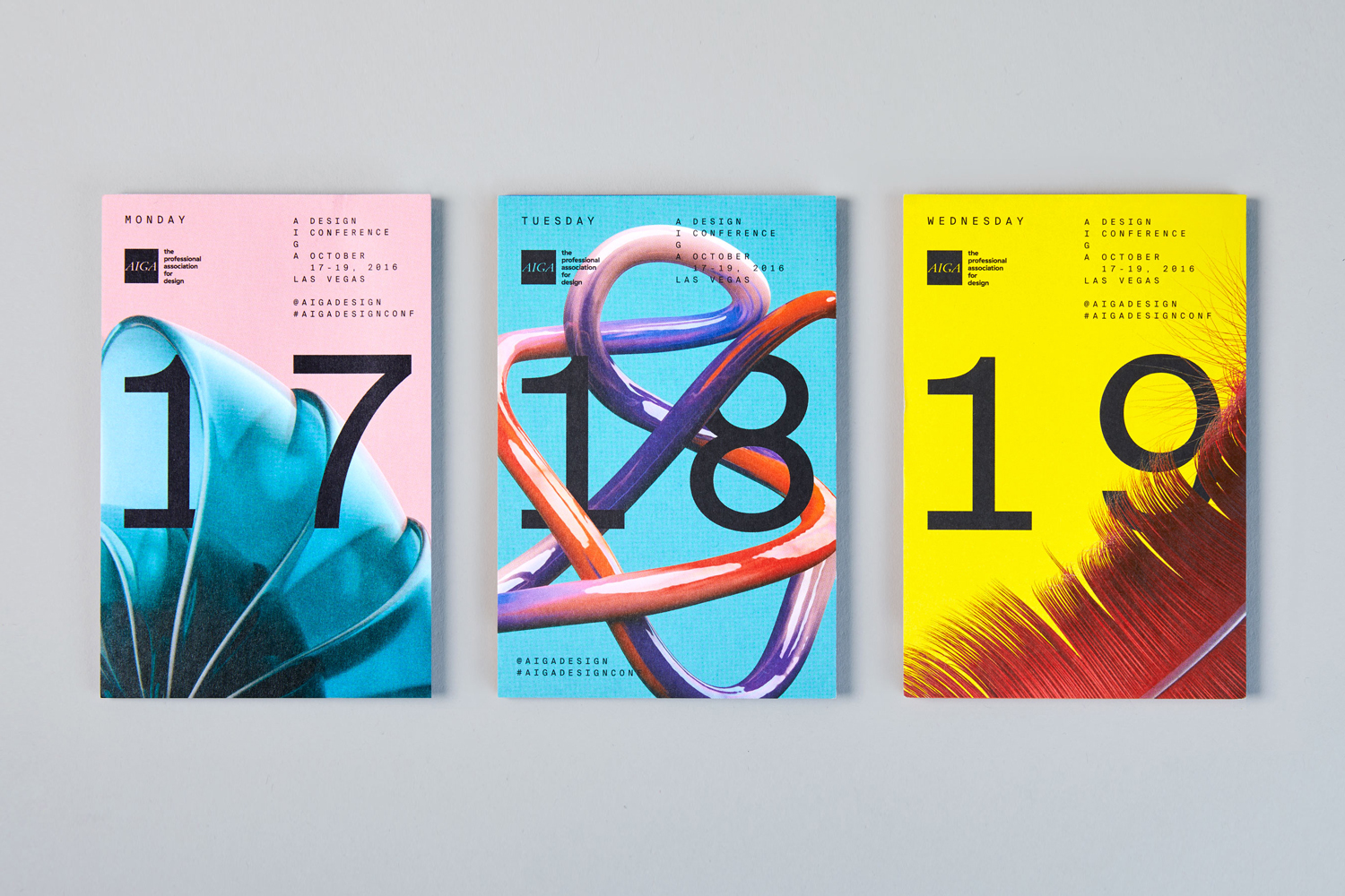
AIGA Brand Identity 2017
Associated creatives

Tags
Description
This brand identity project for AIGA features three distinct promotional brochures laid out flat on a neutral grey backdrop. Designed by Mother Design, the collateral incorporates striking typography and vibrant color fields in pink, blue, and yellow. Each brochure displays large numerals alongside event details, utilizing abstract imagery and tactile surface textures. The composition is captured from a clean overhead perspective, emphasizing the sophisticated graphic design system.
Style
Horizontal, Commercial, Clean, Graphic
Techniques
Typography
Industries
Digital Media & Publishers
Color
Pure White (30%)
Navy (30%)
Lemon (40%)
Background
Grey Seamless
Context
Advertising Campaign