
Brand
ProjectBrand Identity
AIGA Brand Identity 2017
Associated creatives

Tags
Description
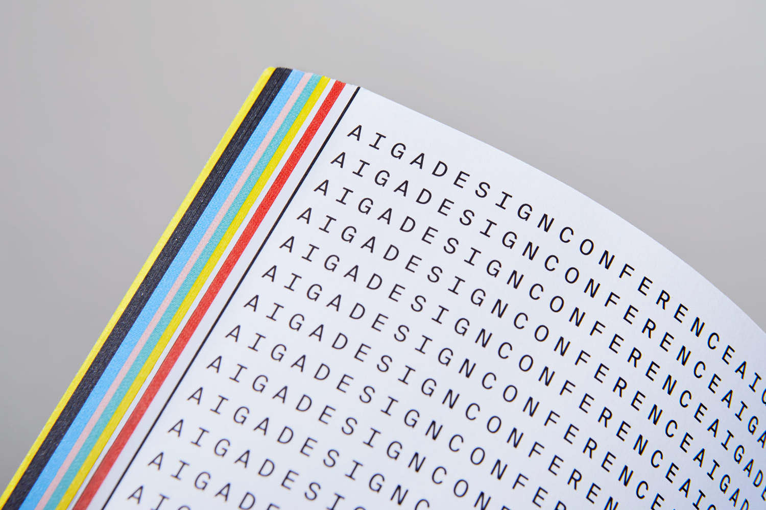
This image presents a close-up angle of a printed publication, highlighting the bound edge and the crisp graphic arrangement of text. Repeated uppercase typography reads AIGA DESIGN CONFERENCE across the white page face, framed by a border line. Along the trimmed edge of the book block, vibrant multi-colored stripes in yellow, blue, red, and black are visible, showcasing precise print production and color separation. The composition is captured with clean lighting against a neutral background, emphasizing graphic structure and typographic precision for the AIGA brand identity project by Mother Design.