Logo
Yoko Ono
Industries

Yoko Ono

1 projects·0 creatives·

Featured Yoko Ono projects

This week's top Yoko Ono projects, carefully handpicked by Visie's expert curators, showcase the best in style and innovation.
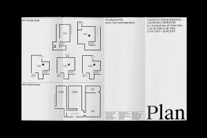
Black and white museum exhibition floor plan brochure with clean typography and multiple gallery room diagrams. Project

Yoko Ono · Brand Identity

The brand identity for the Growing Freedom exhibition featuring Yoko Ono and John Lennon at Fondation Phi exemplifies a masterclass in editorial minimalism. Through a cohesive visual system that spans diverse touchpoints—from architectural window graphics and subway station posters to tactile exhibition brochures—the project relies on a strictly monochromatic palette to command attention. The design language leans into the power of bold, high-contrast typography, utilizing layered serif and sans-serif letterforms that interact with their environments to create geometric precision. By juxtaposing stark, clean paper layouts against raw, organic textures like weathered stone steps or natural-grain plywood construction barriers, the work achieves a sophisticated, cinematic tension. This project functions as an extension of the artistic spirit it represents, employing live-action techniques in its immersive installation displays to bridge the gap between archival media and contemporary design. Every element, whether it is a promotional tote bag or a complex floor plan for the galleries, reinforces a singular, rigorous aesthetic standard. The execution highlights the versatility of the brand identity, which remains sharp and legible across both public transit infrastructure and high-concept gallery displays. With meticulous attention to UI illustration and typographic hierarchy, the studio has crafted a visual narrative that is as conceptually grounded as it is visually striking, effectively translating the legacy of Yoko Ono into a modern, highly controlled design framework.





