Logo
Sommerro Hotel
Industries

Sommerro Hotel

1 projects·0 creatives·

Featured Sommerro Hotel projects

This week's top Sommerro Hotel projects, carefully handpicked by Visie's expert curators, showcase the best in style and innovation.
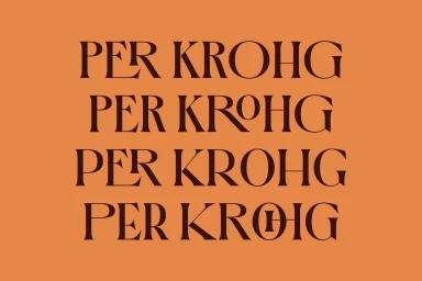
Typography reading Per Krohg set in dark brown serif lettering against a solid burnt orange background. Project

Sommerro Hotel · Brand Identity

The brand identity for Sommerro Hotel, masterfully executed by the creative team at Bielke & Yang, serves as a masterclass in how to bridge historical narrative with modern luxury within the Hotels, Travel & Hospitality industry. By leaning into a sophisticated visual language, the project elevates the hotel’s status as a premier destination, effectively marrying Oslo’s storied Art Deco architecture with a contemporary sense of polish. The design suite is anchored by a deliberate, restrained color palette—predominantly deep chocolate-browns, muted oranges, and rich maroons—which provides a consistent backdrop for an array of meticulously crafted assets. Through the strategic use of typography and vector illustration, the identity functions as both a functional tool and an artistic statement. The work utilizes a clean, geometric typeface that feels both timeless and sharp, while the integration of archival film documentary imagery creates a palpable sense of heritage and place. Subtle techniques such as natural light and soft light photography for tactile brand collateral further ground the digital elements, ensuring a cohesive experience that bridges the gap between the hotel’s historic masonry and its future-facing service. The resulting brand presence is not just a logo, but a comprehensive storytelling ecosystem that captures the essence of refined, neighbourhood-centric hospitality through intentional graphic design and architectural reverence.





