Logo
Chāmpo
1 projects·0 creatives·

Featured Chāmpo projects

This week's top Chāmpo projects, carefully handpicked by Visie's expert curators, showcase the best in style and innovation.
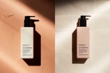
Two Champo hair product bottles standing on textured surfaces under diagonal harsh lighting casting strong dark shadows. Project

Chāmpo · Brand Identity

The brand identity for Chāmpo establishes a sophisticated visual language that masterfully bridges the gap between ancient Ayurvedic wisdom and modern, high-end hair care. This project, which centers on a cohesive and minimalist aesthetic, leans into editorial minimalism to elevate the brand’s presence within the crowded beauty industry. Through a series of carefully composed product shots and graphic assets, the work emphasizes the geometric precision of the packaging, utilizing soft light to highlight the matte textures of the containers and the intentionality of the typography. The design execution relies on a restrained color palette of pale pinks, beiges, and whites, creating a professional, clean environment that feels both premium and approachable. By integrating a sleek sans-serif wordmark and delicate graphic icons, the brand identity effectively communicates its focus on natural balance and structural elegance. The photography captures these elements through a mix of cinematic hard light, which casts dramatic shadows to add depth, and diffused natural light that underscores the soft, tactile nature of the materials. With graphic design direction provided by COMMISSION, the project maintains a consistent, polished look that transcends traditional commercial photography, ensuring that every angle and composition speaks to the thoughtful, intentional spirit of the brand. The resulting identity is a masterclass in modern product presentation, demonstrating how subtle design cues can build a strong, memorable narrative.





