Logo
Apotek1
1 projects·0 creatives·

Featured Apotek1 projects

This week's top Apotek1 projects, carefully handpicked by Visie's expert curators, showcase the best in style and innovation.
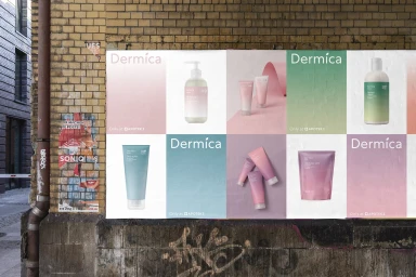
Posters featuring Dermica skincare products and gradient packaging displayed on an exterior brick wall. Project

Apotek1 · Brand Identity

The new brand identity for Apotek1, specifically for the Dermica skincare line, masterfully bridges the gap between clinical reliability and contemporary aesthetic appeal. By leaning into a clean, minimalist design language, the project elevates pharmacy-grade skincare into the realm of modern beauty branding. Across a diverse array of assets, the visual strategy centers on a consistent color palette of soft pastels and smooth gradients, which are balanced by precise, sans-serif typography. The execution utilizes a sophisticated soft light technique, ensuring that the textures of the tubes, bottles, and refill pouches remain the focal point, regardless of whether they are presented in a studio setting or against the grit of an urban landscape. Goods has provided the essential graphic design foundation, ensuring that the transition from 3D render and CGI elements to live-action photography remains seamless and coherent. The project effectively uses a monochromatic approach and architectural paper curves to evoke a sense of calm, clinical expertise while maintaining a highly accessible, consumer-facing allure. This commercial campaign succeeds by stripping away excess, allowing the clean packaging design to speak for itself. The result is a cohesive brand identity that feels both accessible and elevated, perfectly positioning Dermica as a staple of modern self-care that maintains its authority within the competitive beauty and skincare market.





