

UDO
Featured UDO projects
This week's top UDO projects, carefully handpicked by Visie's expert curators, showcase the best in style and innovation.
 Project
 UDO · Brand Identity
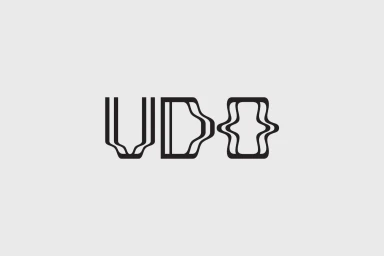
Nikos Georgópoulos delivers a masterclass in restrained elegance with the new brand identity for UDO, a project that demonstrates how deliberate typography can define a premium market presence. By stripping away the superfluous, the visual system leans into an aesthetic of editorial minimalism, where the focus remains squarely on the interplay between form and negative space. The core mark utilizes fluid, distorted letterforms that feel both architectural and organic, creating a distinct visual language that is successfully carried across a variety of commercial applications. From the crisp precision of embossed business cards to the tactile, debossed texture of linen-bound books, the identity thrives on a tactile sensibility. The use of vector-based graphic design ensures that the UDO mark remains sharp and scalable, while the strategic application of studio strobe lighting in the photography emphasizes the depth and high-end material quality of the collateral. Every element of this system, from the clean sans-serif typography to the balanced geometric framing, speaks to a contemporary approach where clarity is the ultimate luxury. By favoring high-contrast monochromatic palettes and natural light to showcase paper textures, Georgópoulos establishes a versatile and sophisticated foundation for the brand, ensuring that UDO resonates as a modern, design-forward entity in an increasingly crowded commercial landscape.
UDO · Brand Identity
Studio Foss developed a comprehensive brand identity system for UDO, focusing on the visual representation of the Super 6 analog-hybrid synthesizer. The project spans a wide range of collateral, from apparel and corrugated packaging to instructional manuals and outdoor poster installations. The design system employs a minimalist aesthetic, anchored by bold, high-contrast typography and a restrained monochrome palette. Technical diagrams, abstract graphic symbols, and starburst motifs are integrated throughout the identity to reflect the precision of the hardware. Across motion graphics and print, the work utilizes a clean, grid-based layout that prioritizes functional clarity alongside structural graphic forms. The execution incorporates a variety of techniques, including digital motion graphics, 3D rendering for packaging visualization, and tactile print finishes such as grainy screen-printed textures.
Explore other brands
Explore Visie’s leading industries, projects, and the talented creatives representing them.





