Logo
Onkruid
1 projects·0 creatives·

Featured Onkruid projects

This week's top Onkruid projects, carefully handpicked by Visie's expert curators, showcase the best in style and innovation.
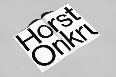
An open printed publication featuring bold oversized black typography spelling Horst Onkruid on white paper against a neutral gray background. Project

Onkruid · Brand Identity

The brand identity for Onkruid stands as a masterclass in editorial minimalism, demonstrating how a singular design language can bridge the gap between corporate professional services and the vibrant, lived-in energy of a festival environment. Through a sophisticated visual system developed by Vrints-Kolsteren, the project leans into a high-contrast aesthetic that pairs bold, modern sans-serif typography with a stark, architectural use of negative space. By utilizing a deliberate palette of black, white, and strategic bursts of vibrant orange, the branding avoids clutter, favoring instead a functional elegance that translates seamlessly from print collateral to large-scale urban signage. The execution feels deeply tactile; whether it is the sharp, high-angle documentation of stationery on textured paper or the integration of posters against the weathered, urban grit of corrugated metal fencing, the identity maintains a consistent, premium feel. This is further elevated by the clever use of vector graphics and live-action techniques, allowing the branding to capture the atmospheric duality of public spaces and quiet, organized interiors. Ultimately, the work functions as a complete, cohesive system that respects the importance of information hierarchy while maintaining an artistic edge. It is a striking example of how disciplined graphic design can create a lasting impression, transforming everyday promotional elements into a unified, high-impact cultural statement.





