
Zion Wine: Brand Identity

Apr 2023
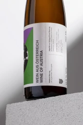
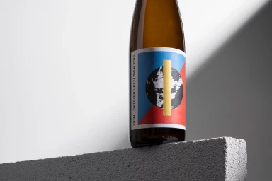
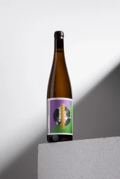
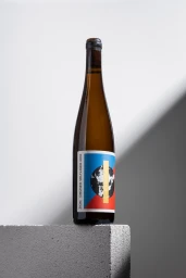
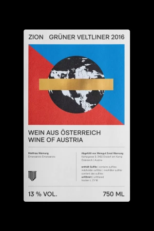
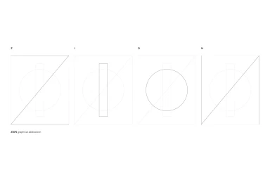
Zion Wine’s brand identity project centers on a refined, minimalist packaging system. The visual strategy leans into bold typography paired with geometric color blocking, using a restrained palette of purple, green, red, and blue. Each label design incorporates structured graphic elements, including circular map illustrations and metallic gold foil accents that contrast against textured paper substrates. Designed by Lukas Diemling, the project utilizes clean lines and precise layouts to elevate the brand's presence within the food and beverage industry. The execution across both packaging and supporting abstract graphic collateral emphasizes a technical, vector-based approach to design. Studio photography, rendered via 3D CGI and commercial techniques, places the product within a neutral, architectural environment to maintain a sharp, contemporary aesthetic.
Vertical, Commercial, Clean, Minimalist
Typography
E-commerce / Product
