
Ladler: Brand Identity

Dec 2023
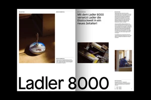
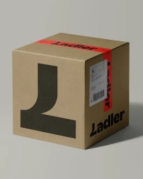
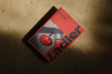
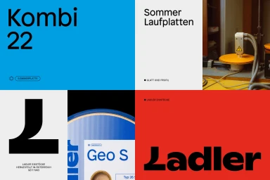
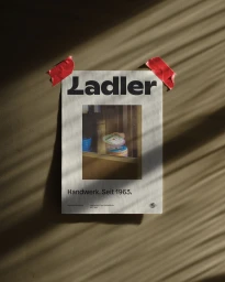
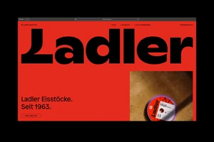
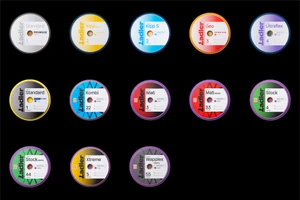
The Ladler Brand Identity project establishes a cohesive visual language for the curling equipment manufacturer, bridging traditional craftsmanship with modern industrial design. Created by Lukas Diemling, the identity system leverages bold typography, a high-contrast color palette of black, red, and blue, and minimalist editorial compositions to unify product packaging, marketing collateral, and digital interfaces. The project channels a tactile aesthetic through professional product photography that captures the textures of curling stones against concrete and wooden surfaces. Utilizing clean graphic design and structured multi-column layouts, the work emphasizes the precision of the manufacturing process. Throughout the series, natural light and directional shadows enhance the brand’s visual depth, creating a refined, contemporary look that highlights product specifications and historical brand heritage.
Horizontal, Commercial
Typography
Advertising Campaign
