
YATAI: Brand Identity

Feb 2024
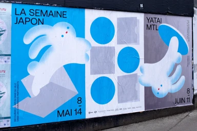
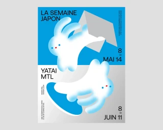
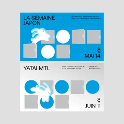
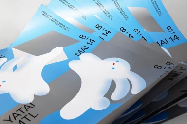
The brand identity for YATAI, developed by Baillat Studio, centers on a vibrant visual language that merges bold typography with playful, abstract illustrations. The project spans multiple formats, including outdoor wheatpaste posters and dynamic motion graphics, to establish a consistent aesthetic across the event's communications. Utilizing a palette of deep blue, neutral grey, and crisp white, the design system employs minimalist layouts and geometric motifs. These elements are punctuated by stylized character illustrations that provide a sense of movement, whether captured in static print materials or animated sequences. The execution leans into a clean, modern graphic aesthetic, balancing functional event information with high-contrast vector visuals.
Commercial, Graphic
Typography
Advertising Campaign
