
Weezy: Brand Identity


Apr 2021
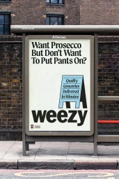
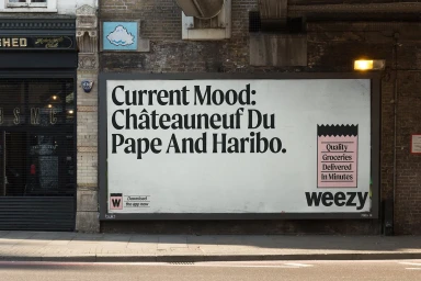
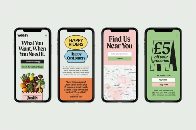
The brand identity for Weezy, developed by Otherway, establishes a cohesive visual language for the grocery delivery service. The project spans a variety of touchpoints, from urban out-of-home advertising to mobile interface design. Key executions include a series of posters and billboards that lean into a minimalist aesthetic. These pieces utilise bold serif typography and a vibrant palette of pastel tones to communicate the brand's fast-delivery proposition. The design relies on clean graphic layouts and playful, approachable illustrations that remain consistent across both physical street signage and the app's digital user interface. Captured in natural light, the campaign imagery emphasizes high-contrast typography and clear communication, maintaining a consistent commercial identity across varied urban backdrops.
Commercial, Clean, Horizontal
Natural light
Street
Out of Home (OOH)
