
Mouthwash: Brand Identity


Dec 2019
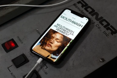
Mouthwash transcends the boundaries of traditional corporate branding by curating an identity that feels as tactile as it is digital. Through an expert blend of commercial design and editorial minimalism, the studio establishes a visual language defined by bold sans-serif typography and a rigorous grid-based structure. Whether showcasing a seasonal lookbook or the gritty, utilitarian charm of industrial machinery, the brand identity project leverages cinematic lighting and a documentary sensibility to ground its digital output in reality. The studio balances sleek UI illustrations with the raw, textural quality of everyday objects, such as corrugated cardboard and transparent acrylic, to create a cohesive lifestyle narrative. By weaving together disparate elements—from donut shop facades to high-fashion portraiture—the project reads as a masterclass in modern brand storytelling. This versatility is further underscored by the intelligent use of negative space, which allows the identity to remain both highly legible and visually arresting across diverse media. Ultimately, Mouthwash succeeds in bridging the gap between professional, structured corporate design and the expressive, lived-in aesthetic of contemporary independent publishing. Through these carefully considered layouts, the brand identity proves that utility and art can coexist, ensuring the Mouthwash voice remains distinct, memorable, and consistently elevated in an increasingly crowded digital landscape.
Clean, Vertical
Typography
