
Vikelas Architects: Brand Identity
Feb 2019
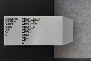
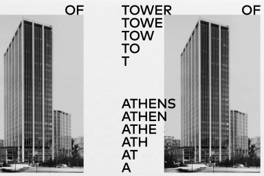
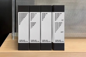
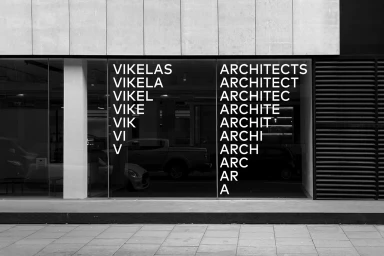
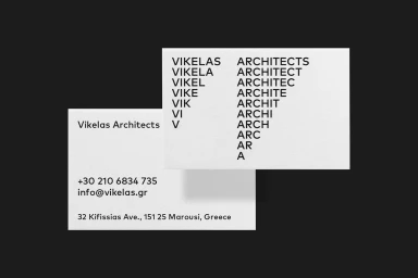
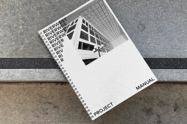
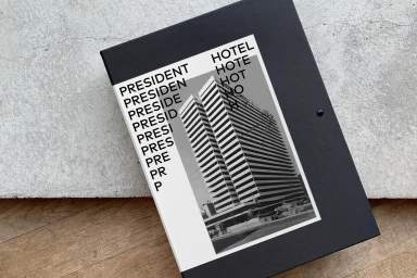
The new brand identity for Vikelas Architects masterfully bridges the gap between functional corporate design and high-concept artistic expression. By leaning into a rigid, minimalist aesthetic, the project successfully captures the essence of architectural precision while establishing a distinct visual language that permeates every touchpoint. The design system centers on a signature cascading typography technique, where the firm's name is repeated and systematically reduced in length, creating a rhythmic, geometric pattern that feels both structural and playful. This motif carries across a diverse range of physical collateral, from business cards and project manuals to the architectural facade signage of their Athens office. The graphic design, spearheaded by Miltos Bottis and the team at AG Design Agency, utilizes a monochromatic, high-contrast palette to ensure clarity and professional gravitas. The use of varied material textures—such as industrial concrete, warm wood grain, and perforated metal—adds depth to the commercial branding, framing the identity within a grounded, real-world context. By emphasizing negative space and clean, sans-serif lines, the project transcends simple corporate communication, offering a cinematic approach to brand representation that feels at home in a contemporary design firm environment. The result is a cohesive and deliberate identity that reflects the firm's own commitment to geometry, modern infrastructure, and editorial minimalism in the competitive landscape of international real estate platforms.
Horizontal, Commercial, Clean, Minimalist
Typography
Advertising Campaign

