
Euréka: Brand Identity
Jul 2019
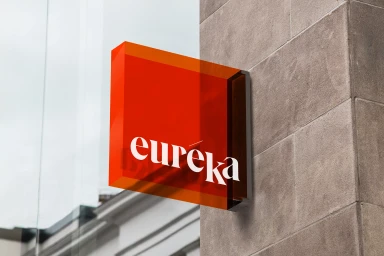
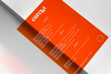
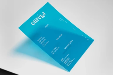
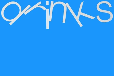
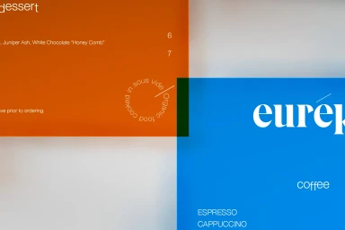
The new brand identity for Euréka marks a sophisticated departure into the realm of contemporary corporate aesthetics, driven by the expert graphic design hand of Miltos Bottis. This project thrives on a striking tension between high-contrast color blocks and clean, geometric precision, effectively defining a visual language that feels both modern and inherently professional. By utilizing a vibrant, saturated palette of orange and blue, the identity anchors its minimalist approach, ensuring that every element—from the deconstructed sans-serif typography to the intentional use of negative space—communicates clarity and purpose. The work spans diverse touchpoints, including environmental signage, detailed infographics, and menu design, all tied together by a consistent commitment to typographic excellence. Whether through a translucent red acrylic sign mounted against stone or a digital vector layout, the branding leans into a refined, high-end feel that avoids unnecessary clutter. Techniques like the use of sharp, fragmented letterforms and vector-based compositions underscore a forward-thinking artistic vision. This identity system effectively bridges the gap between commercial practicality and artistic expression, offering a cohesive and memorable presence for the brand. Through careful alignment and structural rhythm, the design successfully elevates mundane functional items into cohesive pieces of corporate communication, proving that a disciplined, minimalist framework remains the most powerful tool for building a lasting, recognizable contemporary brand.
Commercial, Horizontal, Graphic
Typography
Advertising Campaign
