
Verdura
Brand Identity
Sep 2017
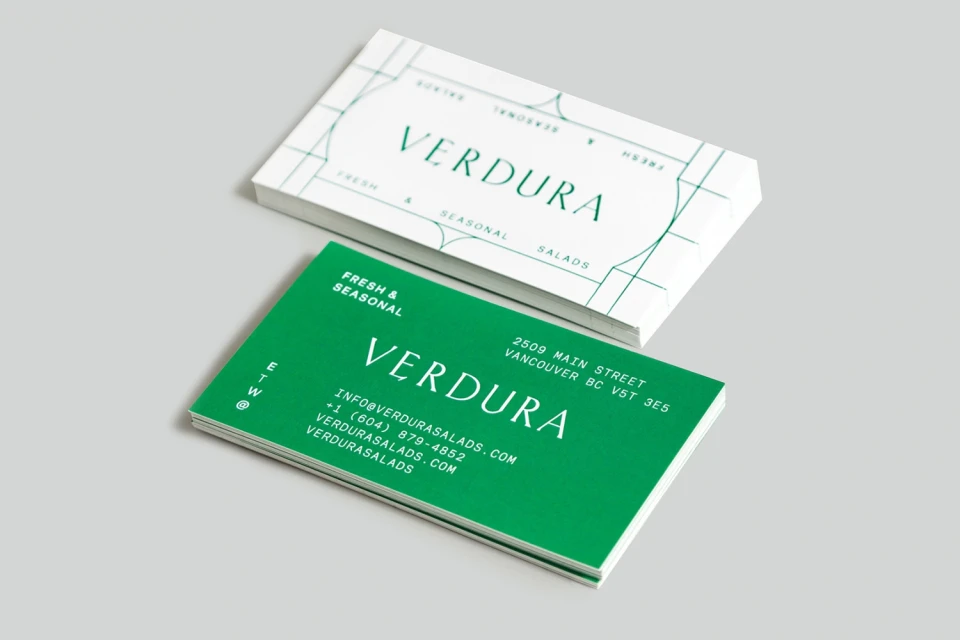
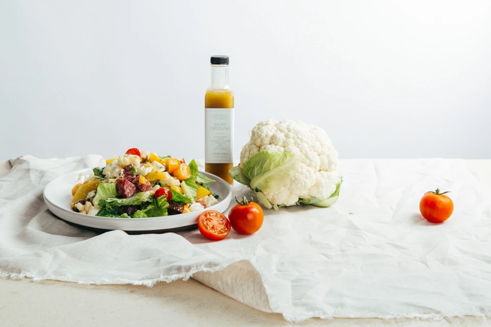
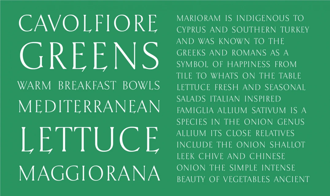
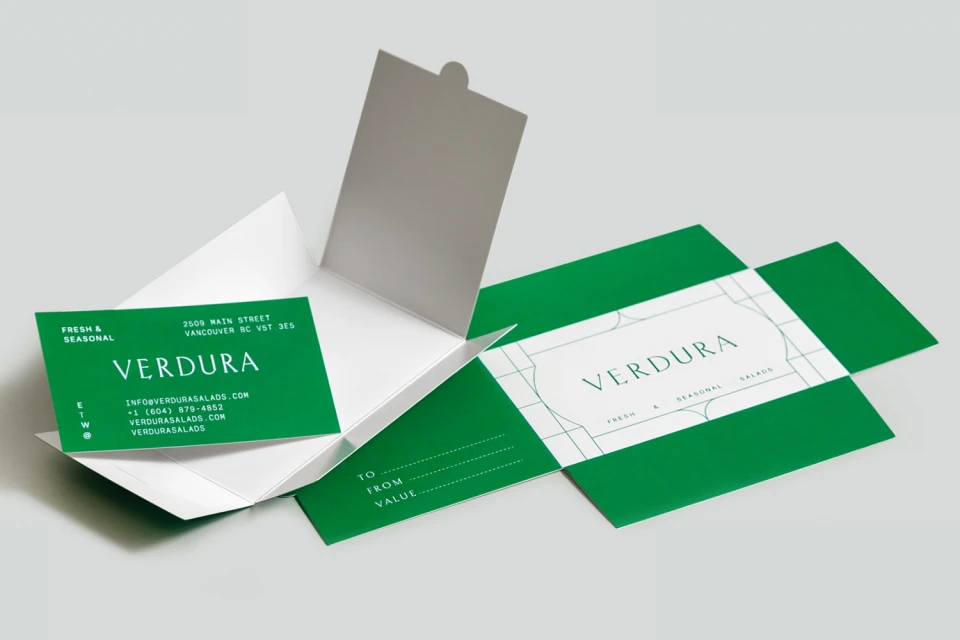
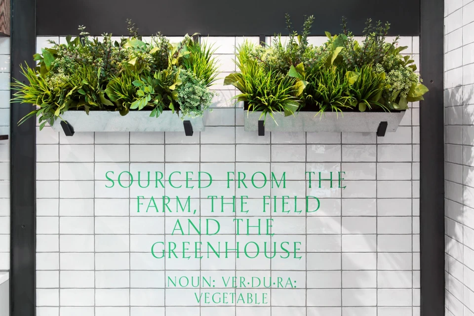
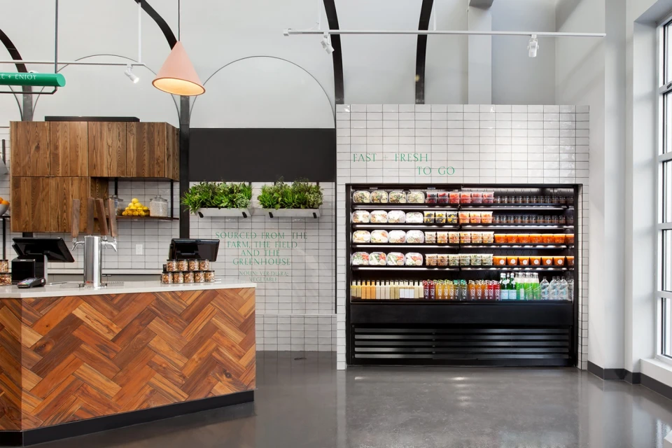
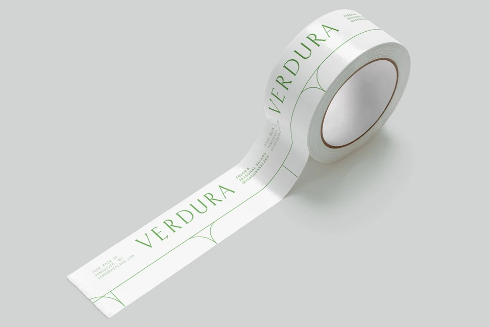
The brand identity for Verdura creates a sophisticated visual language that masterfully bridges the gap between agricultural roots and contemporary retail elegance. Developed by the design studio Glasfurd & Walker, the project leans into a minimalist aesthetic, utilizing a restrained, high-contrast palette of vibrant forest green and stark white. This editorial approach to corporate branding is anchored by a classic, refined serif typeface that establishes a premium feel across all touchpoints, from the structural geometric framing of the business collateral to the functional elegance of the adhesive packaging tape. The campaign effectively channels a clean, professional sensibility that resonates throughout the physical retail environment, where industrial-style galvanized metal planters and herringbone wood textures provide an organic counterpoint to the rigid, tiled architecture. By integrating food-inspired typography and botanical themes, the design team has curated a cohesive system that elevates the brand, ensuring that the identity is as much about the provenance of the produce as it is about the aesthetic experience. Captured with a mix of soft natural light and precise studio strobe photography, the work demonstrates a mastery of typography and layout that feels both timeless and perfectly suited to the modern Mediterranean-inspired culinary landscape.
Horizontal, Commercial, Clean, Minimalist
Typography
Advertising Campaign
