United Sodas of America: Brand Identity

Nov 2020
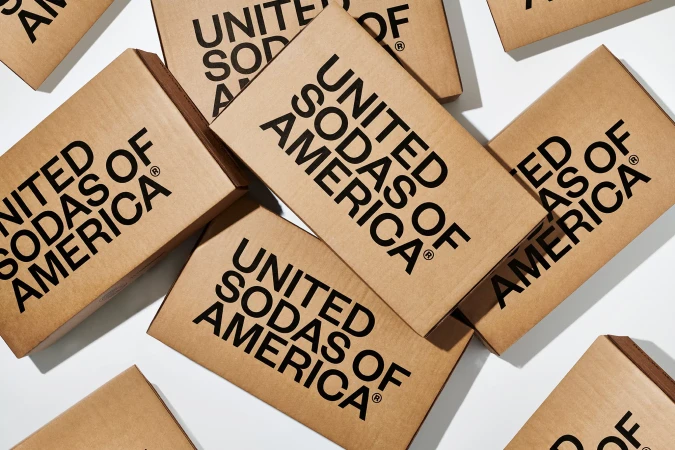
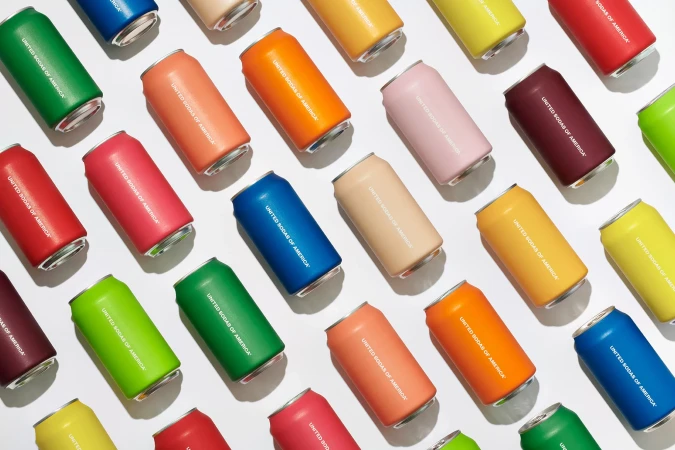
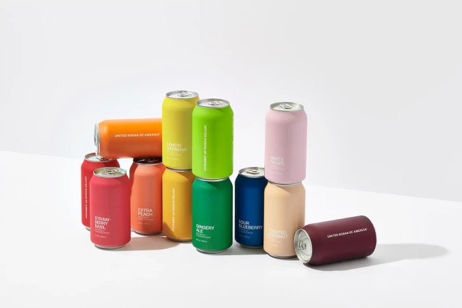
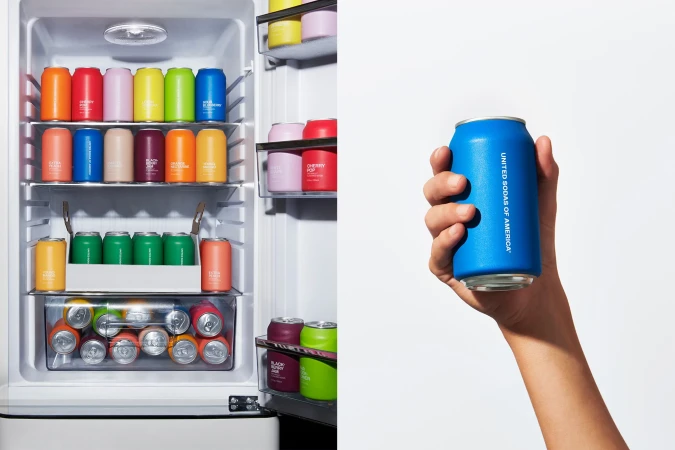
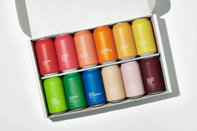
United Sodas of America introduces a refreshed brand identity, centralising on a vibrant, colour-forward approach to beverage packaging. The project, featuring graphic design by Center, utilises a minimalist aesthetic that relies on clean typography and matte finishes to distinguish its variety of soda flavours. Captured by photographer Mari Juliano, the product imagery leans into a commercial, clean visual language. High-angle compositions and balanced, natural light highlight the structural design of the shipping materials and the systematic arrangement of the aluminium cans. The work presents a cohesive look across both digital and physical touchpoints, emphasising the geometric precision of the packaging design.
Horizontal, Commercial, Clean, Minimalist
Natural light
White Seamless
E-commerce / Product