skincare brand Tome: Brand Identity
Sep 2026
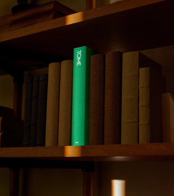
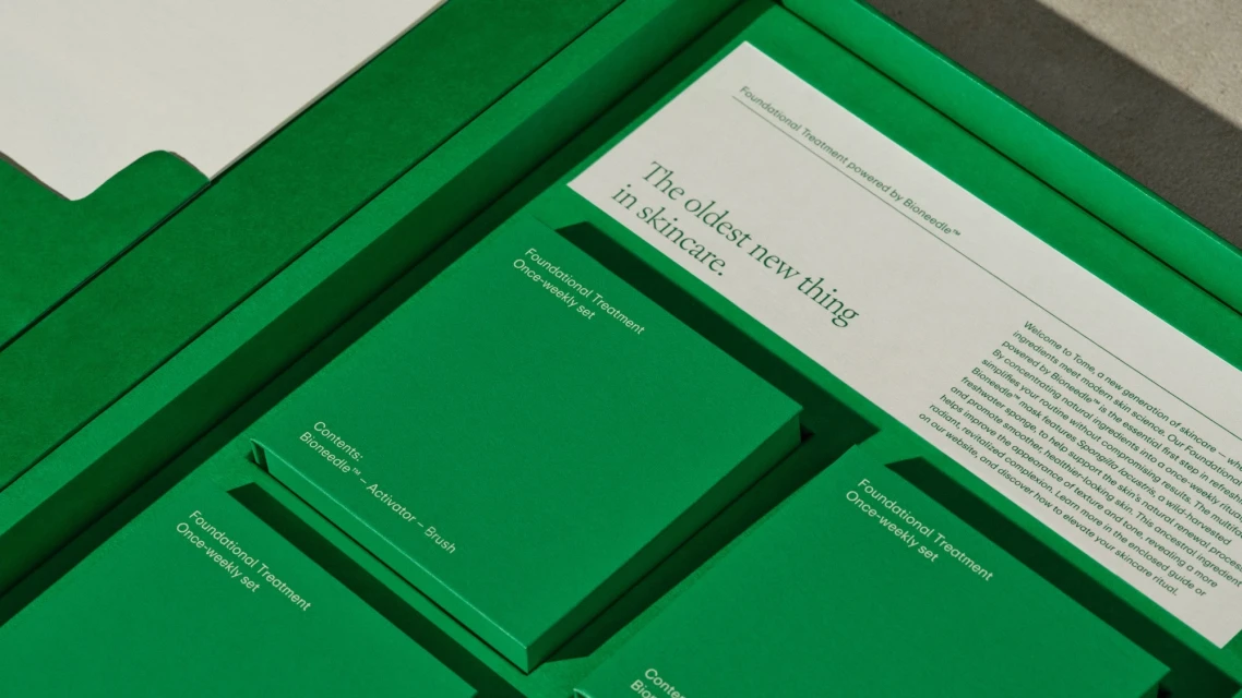
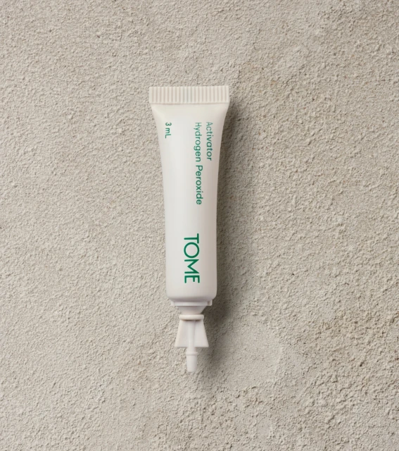
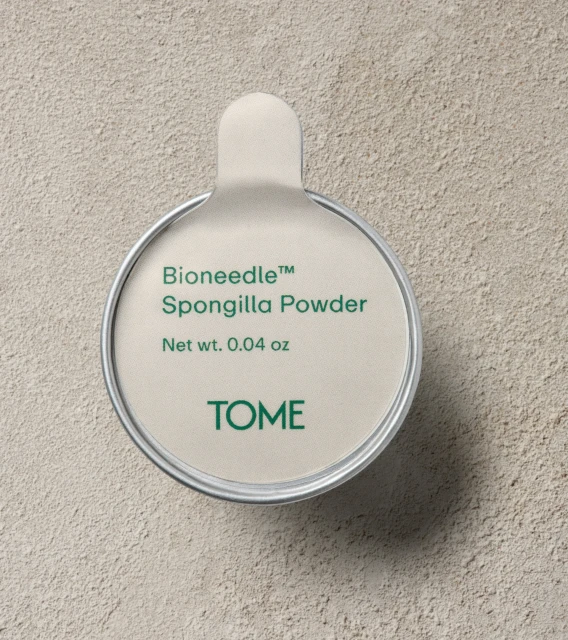
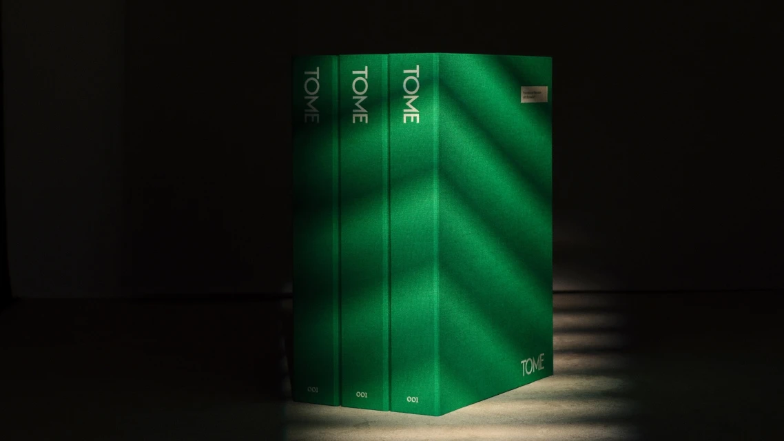
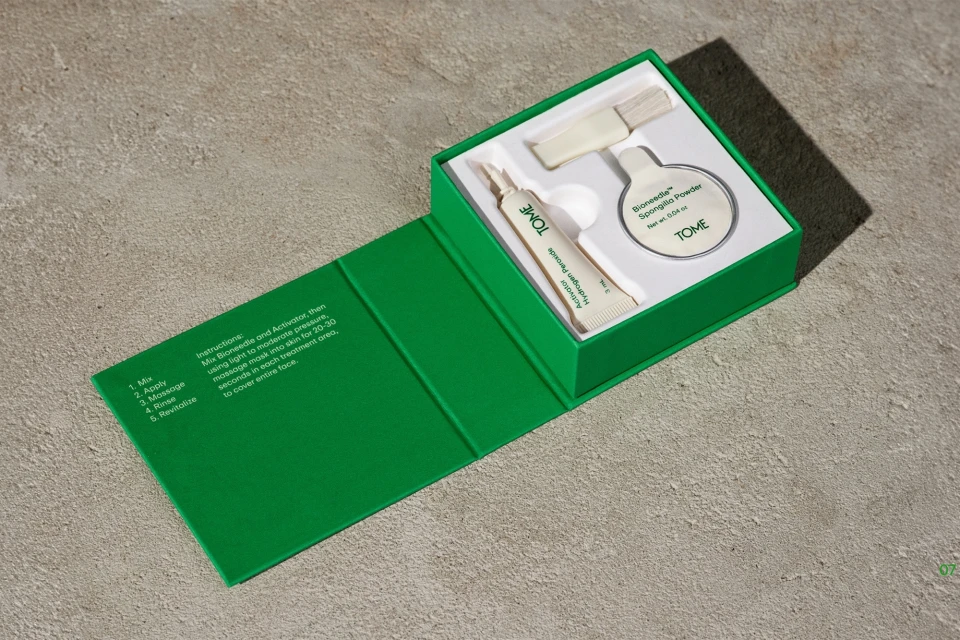
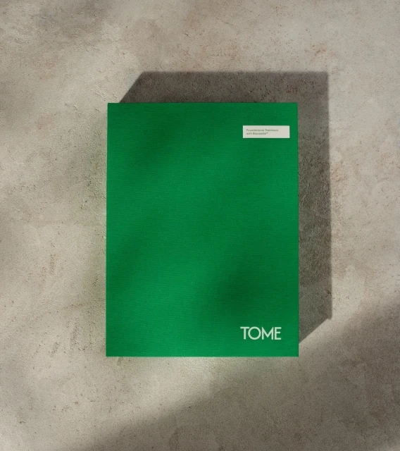
The brand identity for skincare brand Tome emphasizes a minimalist aesthetic, pairing vibrant emerald green packaging with clean typography across its product range. The identity, developed through a collaboration between REUNION, The Collected Works, Young Woo, Mari Juliano, and Oak Studios, utilizes natural light and tactile textures like stone and concrete to frame the visual language. Captured through commercial photography and detailed 3D renders, the project focuses on structured compositions and matte finishes. The visual system balances light and shadow, incorporating techniques such as low-key lighting and minimalist framing to highlight the precision of the packaging design.
Commercial, Horizontal, Minimalist, Clean
Skincare
E-commerce / Product