
Twice
Brand Identity
Nov 2015
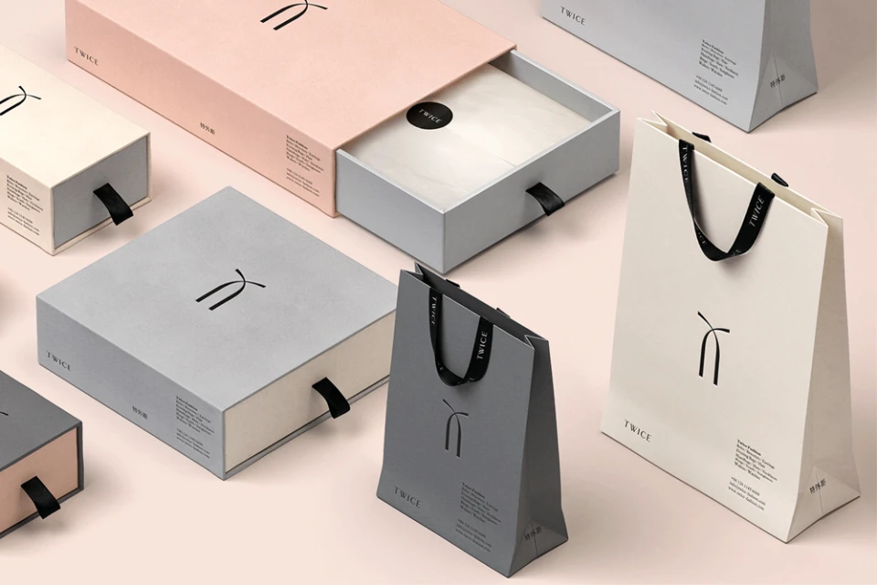
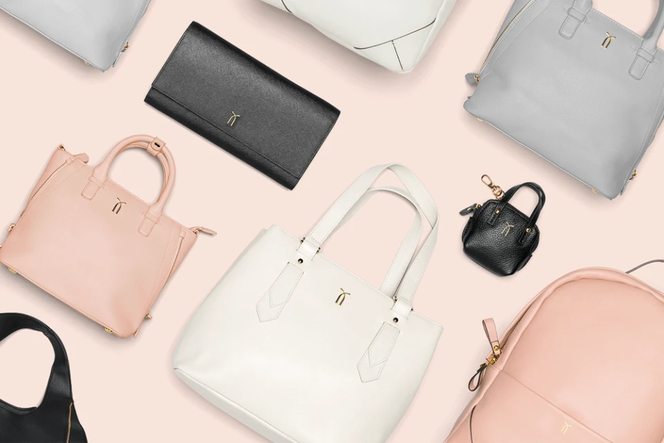
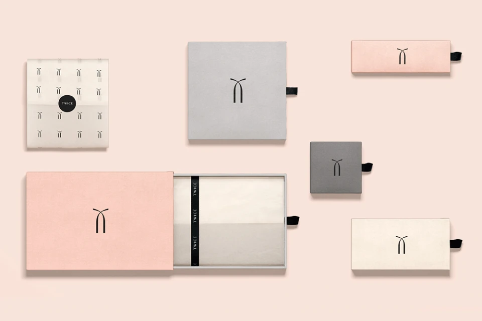
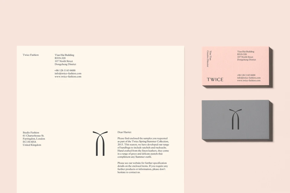
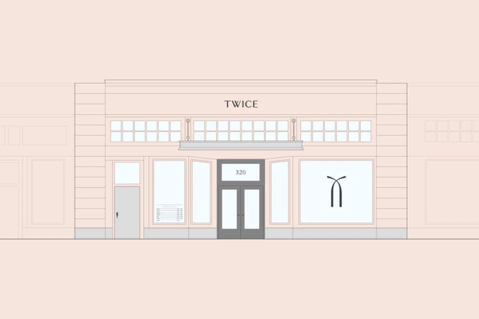
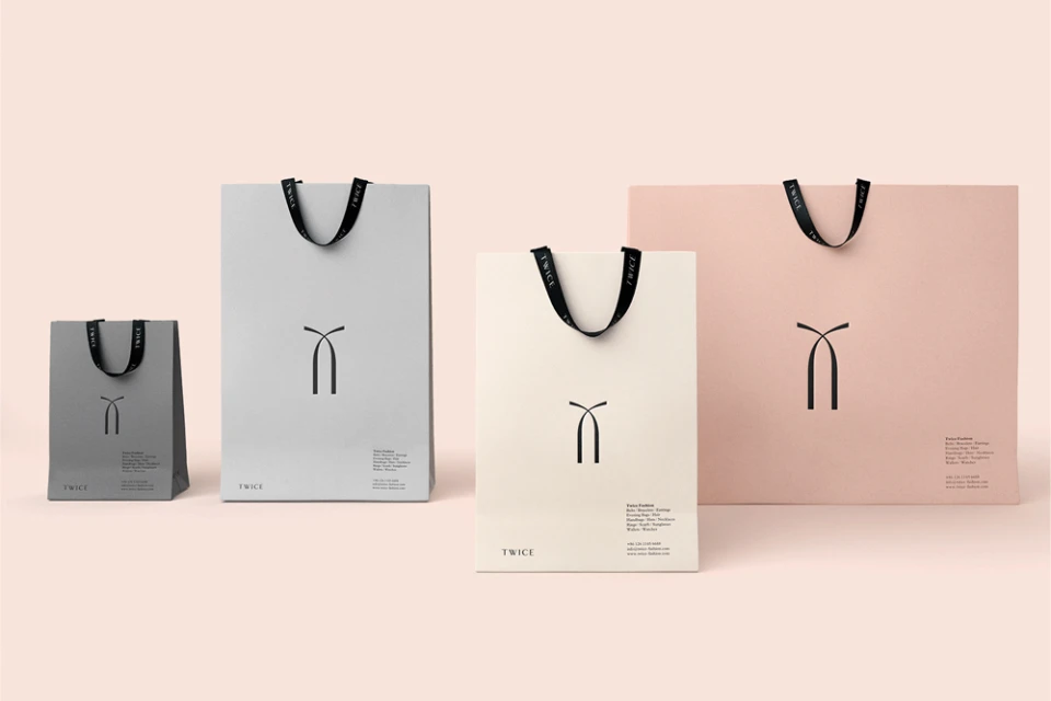
The brand identity for Twice represents a masterclass in editorial minimalism, channeling a sophisticated visual language that feels both modern and inherently timeless. Orchestrated by Socio, the project serves as a comprehensive exploration of corporate branding, where every element—from the tactile packaging to the rhythmic application of typography—is calibrated to project a sense of high-end, contemporary luxury. The identity relies on a restrained palette of soft pastel pink, cream, and muted charcoal, allowing the strength of the geometric emblem and the precision of the serif and sans-serif typefaces to command attention. Across the various touchpoints, including stationery, custom sliding-drawer boxes, and conceptual storefront architecture, the design maintains a rigorous balance and clarity that elevates the entire consumer experience. The execution leans heavily into a clean, professional aesthetic, utilizing vector precision and 3D render techniques to ensure a seamless translation between physical materials and digital assets. By prioritizing airy spacing and structural symmetry, the project avoids the visual noise typical of retail environments, opting instead for a deliberate, pared-back approach that honors the quality of the product. This cohesive system for Twice demonstrates the power of restraint, proving that a brand identity is most resonant when it operates as a perfectly unified, minimalist dialogue between shape, texture, and refined color.
Horizontal, Commercial, Clean, Minimalist
Solid Colour
Advertising Campaign
