
A.N Other: Brand Identity
Apr 2018
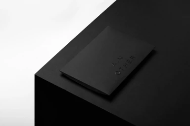
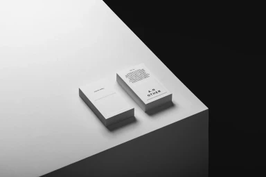
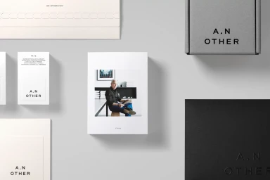
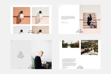
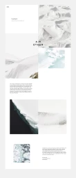
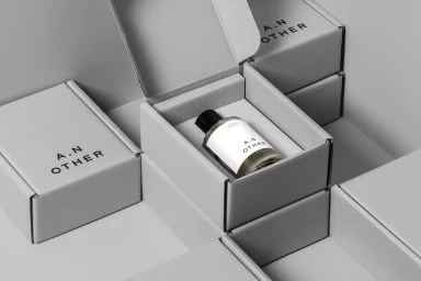
In the crowded landscape of contemporary fragrance, the brand identity for A.N Other emerges as a masterclass in restraint, stripping away the superfluous to reveal the core of the house. Executed by the studio Socio, the design system leans into a sophisticated, minimalist aesthetic that bridges the gap between tactile packaging and digital experience. The project utilizes high-contrast monochrome palettes and precise, geometric compositions to elevate standard stationery and shipping materials into premium touchpoints. By employing techniques such as emboss and deboss against high-quality paper stocks, the team ensures that even the smallest interaction with the brand feels intentional and substantial. The editorial approach extends seamlessly into the digital realm, where grid-based layouts and ample negative space allow product photography—often featuring the stark, icy terrain of Svalbard—to command attention. This corporate visual language relies on a clean, sans-serif typography that feels both modern and timeless. Whether through the interplay of low-key chiaroscuro lighting on business cards or the modular, geometric arrangement of shipping boxes, the identity maintains a consistent, elevated narrative. By prioritizing texture and structural rigor, Socio has crafted an environment that feels as curated as the scents themselves, successfully positioning A.N Other as a brand that speaks through subtle, deliberate graphic cues rather than overt noise.
Horizontal, Commercial, Clean, Minimalist
White Seamless
E-commerce / Product
