
Stevenson Systems
Brand Identity


Oct 2016
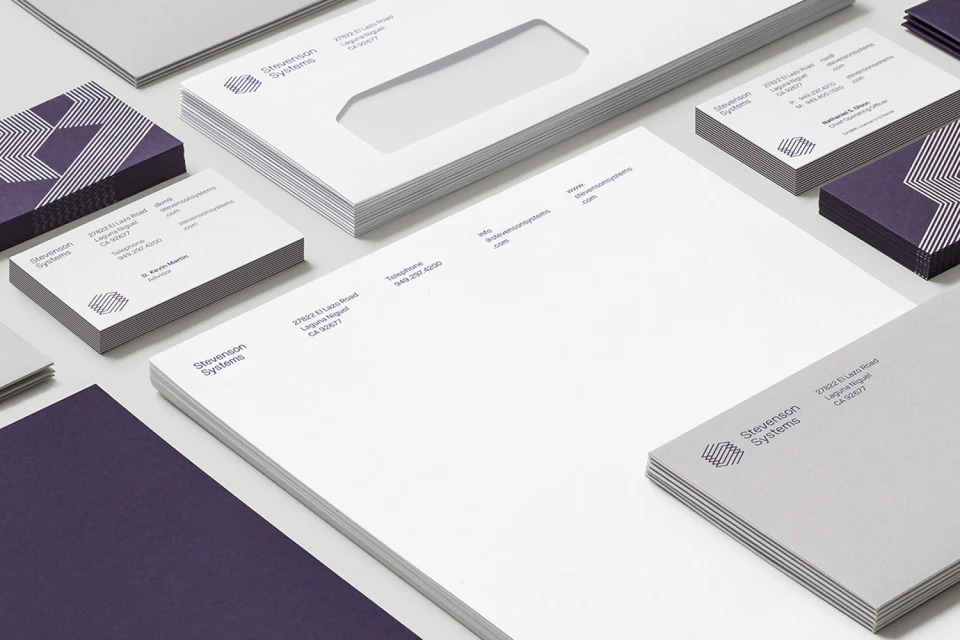
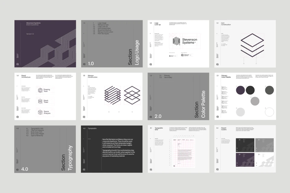
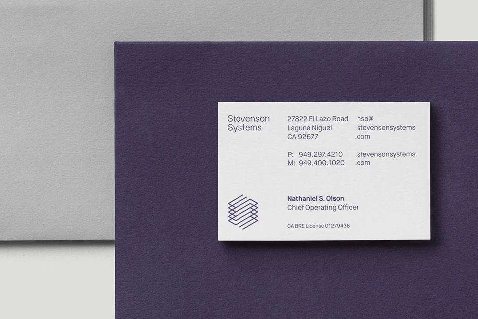
Stevenson Systems has redefined its visual presence through a comprehensive brand identity overhaul that prioritizes clarity, structural integrity, and modern corporate sophistication. Orchestrated by the design experts at Socio, this project moves beyond traditional aesthetics to establish a robust, versatile visual language. By grounding the identity in a refined color palette of deep purples, whites, and greys, the team successfully anchors the company in a space of professional reliability. The project encompasses a full stationery suite, meticulous typography specifications, and an extensive UI illustration library that demonstrates deep attention to grid systems and icon construction. Utilizing studio strobe techniques to highlight the sharp, clean edges of the printed materials, the photography emphasizes a minimalist corporate aesthetic that feels both approachable and authoritative. The system extends seamlessly into the digital realm, with responsive web interface designs that maintain visual consistency across desktop, tablet, and mobile platforms. The integration of geometric hexagonal patterns and uniform vector line art suggests a brand that is technically grounded and ready for a digital-first future. Through careful execution, Socio has crafted a functional toolkit that balances complex mechanical icons with the elegance of high-end business card finishes, ensuring that every touchpoint conveys the structural excellence defining Stevenson Systems in the modern marketplace.
Horizontal, Commercial, Clean, Minimalist
