
Soap Industries
Brand Identity
May 2017
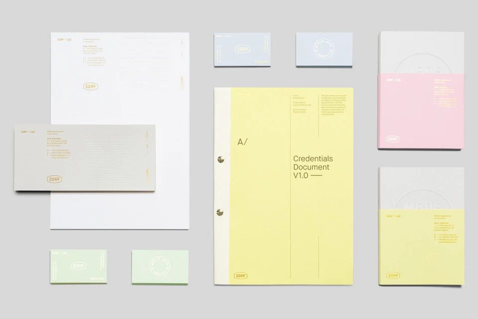
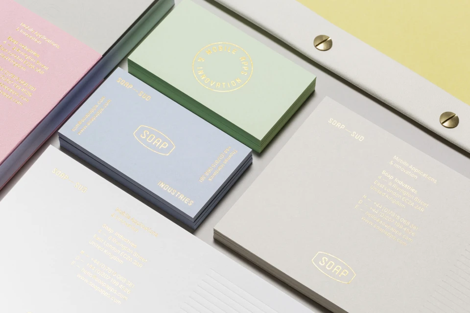
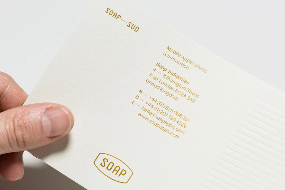
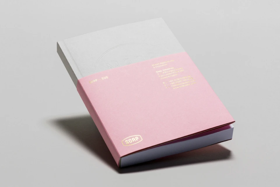
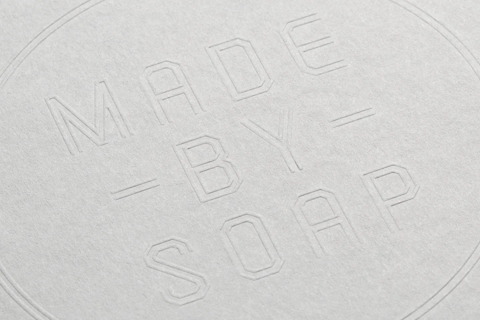
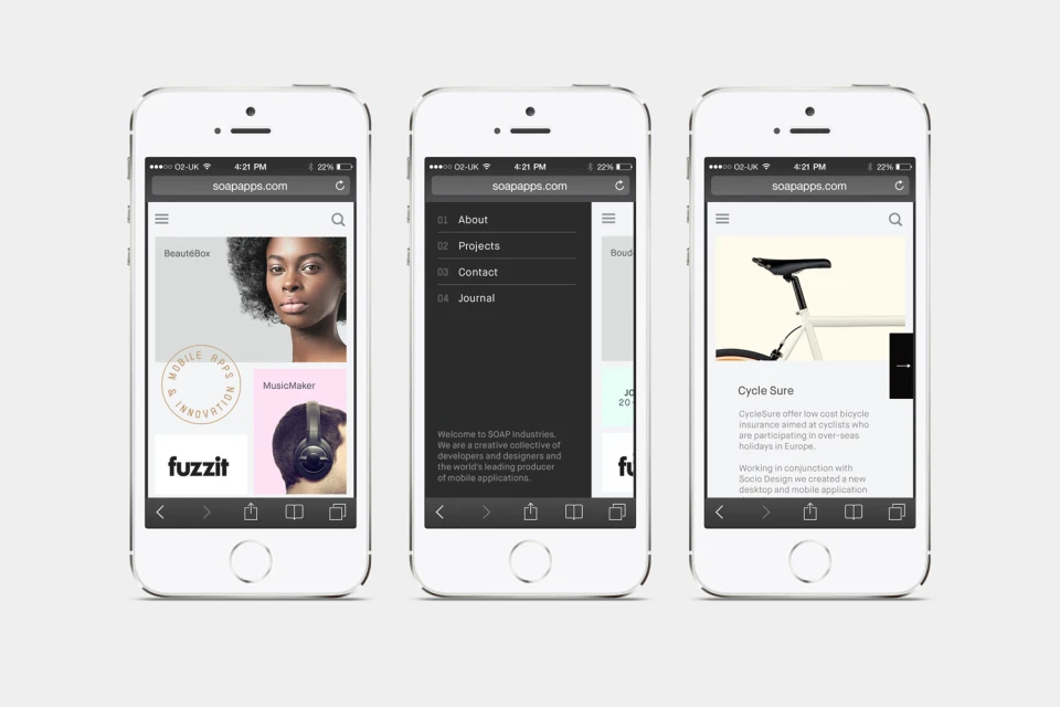
Soap Industries has unveiled a comprehensive brand identity that masterfully bridges the gap between utilitarian functionality and sophisticated corporate aesthetics. Driven by the creative vision of Socio, this identity project serves as a masterclass in minimalist design, establishing a visual language that feels both timeless and distinctly contemporary. The brand identity utilizes a restrained color palette, favoring soft pastels like pale yellow, mint green, and warm grey, which provide a delicate counterpoint to the sharp, industrial precision of its typography. Across a suite of corporate stationery—ranging from debossed business cards to custom notebook bindings—the work leans into a tactile, premium quality underscored by the strategic application of gold foil printing. By integrating high-contrast monospaced sans-serif fonts within rounded badge frameworks, the design ensures clarity while reinforcing the brand's professional credentials. The project extends seamlessly into the digital space, where UI illustration and structured grid layouts translate the physical brand identity into a clean, portfolio-focused mobile experience. Throughout the execution, techniques such as macro photography and studio strobe lighting highlight the meticulous craftsmanship and paper grain, elevating mundane corporate materials into a cohesive, high-end collection. This identity succeeds by stripping away the superfluous, focusing instead on intentional negative space and structured, athletic-style typography to define Soap Industries as a modern, design-led entity prepared for the demands of the global market.
Horizontal, Commercial, Clean, Minimalist
Typography, Emboss & Deboss
Grey Seamless
